Popup Widget
A seamless user experience is crucial for app retention. One effective way to ensure users have the latest features and bug fixes is by implementing popups.
The ML Popup Widget makes it easy to prompt users with a native-style popup when their app version is outdated. This keeps your user base on the latest, most secure version of your app.
By effectively utilizing update popups, you can drive app engagement, improve user satisfaction, and ultimately increase your app's success.
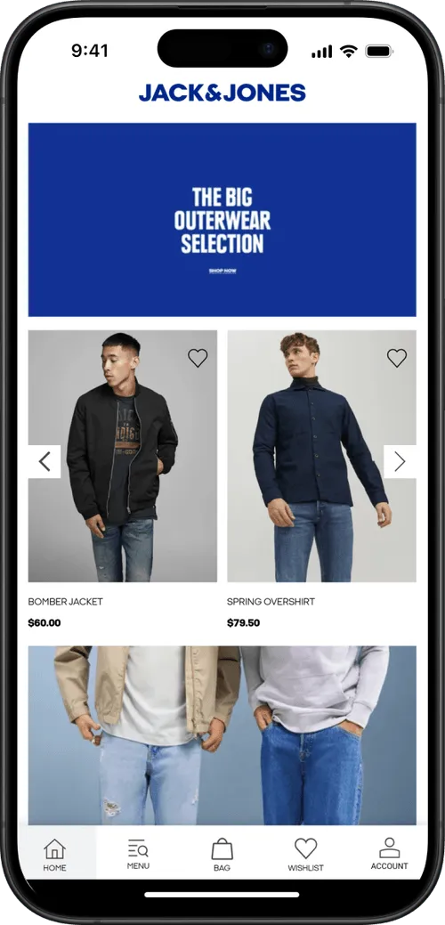
This element can also be used as a normal popup to add a custom UI ele
ment and a different experience in your app.
.avif)
The widget checks the user's app version and displays a popup only if it’s older than your defined minimum version. This works inside mobile apps or webviews, and uses native-feeling styling that resembles iOS or Android prompts.
It also works as a normal popup to provide your users a nice User Experience.
The popup includes:
Paste the following code at the end of your page’s <body>. This popup will show only when the user’s app version is older than your defined minimum version (minVersion), in this code we set the closable param to false, ensuring the popup is not dismissable. Full list of options at the end of this guide:
<script type="module" src="<https://cdn.jsdelivr.net/npm/@mobiloud/ml-popup-widget/dist/ml-popup-widget.min.js>"></script>
<script>
  const popupOptions = {
    popupStyle: 'ios',
    fontFamily: `"Source Sans Pro", "Arial", sans-serif`,
    textColor: '#222',
    textHeading: 'Upgrade required',
    textDescription: 'This app is out of date, please visit store to upgrade to the latest version',
    buttonText: 'Download new version',
    buttonColor: '#000000',
    buttonTextColor: "#ffffff",
    widgetColor: '#fff',
    backDrop: true,
    backDropBlur: true,
    backDropZIndex: 888888,
    zIndex: 999999,
    position: 'center',
    animation: 'fadeIn',
    display: 'onLoad',
    radius: '10px',
    delay: 0,
    shadow: true,
    useSession: false,
    maxWidth: "700px",
    closable: false,
    padding: '20px',
    linkIos: 'https://itunes.apple.com/?PATH-TO-YOUR-APP',
    linkAndroid: '<https://play.google.com/?PATH-TO-YOUR-APP>',
  };

  function addPopupWidget() {
  // Checks if current device is a phone  (deviceData.isMobile) and if its the app (deviceData.isCanvas)
    if (deviceData.isMobile || deviceData.isCanvas) {
      const minVersion = 1.0;
      // Gets current app version
      const appVersion = nativeFunctions.getDeviceInfo().appVersion;
      // Compares the minimum required version with the current app version
      // if appVersion < minVersion, this function returns TRUE
      const isOutdated = deviceData.compareAppVersion(minVersion, appVersion);

      if (isOutdated) {
      // Triggers the widget
        new PopupWidget(popupOptions).init();
      }
    }
  }

  window.addEventListener('load', addPopupWidget);
</script>
The widget have the following methods to compare the current app version and to enable the widget in the app only:
// returns true if its an ios or anroid device
deviceData.isMobile

// returns 'ios', 'android' or 'windows'
deviceData.os

// Returns true if using the app
deviceData.isCanvas

// Accepts two params (numbers)
// if appVersion < minVersion, this function returns TRUE

deviceData.compareAppVersion(minVersion, appVersion)

// CANVAS PLATFORM METHODS

// Returns an object with app metadata and info
nativeFunctions.getDeviceInfo()

/*
mobiloudAppInfo = {
	appId = string,
	appVersion = string,
	brand = string,
	hardware = string,
	manufacturer = string,
	model = string,
	nameos = string,
	osVersion = string,
	platform = string,
	pushSubscribed = bool,
	pushToken = string,
	pushUserId = string,
	timeZone = string
}
*/
This function returns true if the current version is lower than the required minimum. It enables developers to show the popup only when needed, avoiding unnecessary prompts.
You can modify any value in popupOptions to match your app’s tone and design:
textHeading, textDescription, buttonText: Popup contentlinkIos, linkAndroid: Deep link or store URL for each platformpopupStyle : This accepts ‘ios’ for default ios styles or ‘android’ for custom CSS stylesposition, animation, shadow, radius: Look and feelclosable: false: Disables the close (X) button to make the popup mandatoryuseSession: false: Ensures popup shows every time until the app is updateddeviceData.os for getting the current device)closable: false) if the update is required.
| Parameter | Type | Allowed Values / Example | Description |
|---|---|---|---|
popupStyle |
string | ios, android |
Determines the visual style of the popup (currently only ios is supported). |
fontFamily |
string | "Arial", "Helvetica", sans-serif |
Custom font stack for the popup text. |
textColor |
string | #222, black |
Sets the text color used in the popup. |
textHeading |
string | "Upgrade required" |
Heading text displayed at the top of the popup. |
textDescription |
string | "This app is out of date..." |
Description text shown below the heading. |
buttonText |
string | "Download new version" |
Text inside the call-to-action button. |
buttonColor |
string | #000000 |
Background color of the button. |
buttonTextColor |
string | #ffffff |
Color of the button text. |
widgetColor |
string | #fff |
Background color of the popup widget. |
backDrop |
boolean | true, false |
Whether a background overlay appears behind the popup. |
backDropBlur |
boolean | true, false |
Adds a blur effect to the background overlay if backDrop is enabled. If disabled, adds a basic dark backdrop. |
backDropZIndex |
number | 888888 |
Z-index for the background overlay. |
zIndex |
number | 999999 |
Z-index for the popup itself. |
position |
string | top, center, bottom |
Vertical position of the popup on screen. |
animation |
string | fadeIn, slideIn, none |
Animation used when the popup appears. |
display |
string | onLoad |
When the popup should be shown (e.g., on page load). |
radius |
string | 10px, 1rem |
Border-radius for rounding the popup's corners. |
delay |
number | 0, 2000 |
Delay before showing the popup (in ms). |
shadow |
boolean | true, false |
Whether to display a shadow around the popup. |
useSession |
boolean | true, false |
Whether to remember if the popup was shown (per session). |
maxWidth |
string | 700px, 90% |
Max width of the popup container. |
closable |
boolean | true, false |
If false, disables the ability to close the popup manually. |
padding |
string | 20px |
Inner padding of the popup content. |
linkIos |
string | URL to iOS App Store |
Destination URL when clicking the button on iOS devices. |
linkAndroid |
string | URL to Google Play Store |
Destination URL when clicking the button on Android devices. |