Back Button
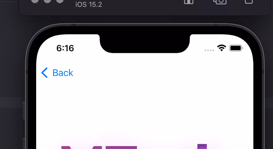
A back button in a native app allows users to navigate to the previously viewed screen or page within the app.
A 'Back Button' in your app is essential for user experience, providing a quick and intuitive way to backtrack through a series of actions or views. Without a back button, users might feel disoriented or frustrated trying to navigate within the app.
This library provides a web based widget that replicates the native look and feel provided by the iOS and Android SDKs. The purpose is to add navigation options to a web app when running in a native app container, like what MobiLoud provides.
Here's an example:
ML Back Button features:
ml-back-button can be used importing the JS code via CDN or as a module using NPM
<script type="module" src="https://cdn.jsdelivr.net/npm/@mobiloud/ml-back-button@latest/dist/ml-back-button.min.js"></script>
<script>
  function addBackButton() {
  	new BackButton().init();
  }
  window.addEventListener('load', addBackButton);
</script>npm i @mobiloud/ml-back-button const options = {
/** Sets the button text color (if string is used in label); Example '#fff'*/
textColor: string,
/** Sets the button fill color (if svg is used in label); Example '#000'*/
fillColor: string,
/** Sets the button background color (if svg is used in label); Example '#000'*/
buttonColorPrimary: string,
/** Sets the button label; Example 'Back', '<svg>...</svg>'*/
label: string,
/** Sets the button position when floating: 'top-right' | 'top-left' | 'bottom-left' | 'bottom-right' */
position: 'top-right' | 'top-left' | 'bottom-left' | 'bottom-right',
/** Sets the button entrance animation: 'fadeIn' | 'scaleUp' | 'slideBottom' | 'slideTop' | 'slideLeft' | 'slideRight' | null */
animation: 'fadeIn' | 'scaleUp' | 'slideBottom' | 'slideTop' | 'slideLeft' | 'slideRight' | null,
/** Sets the button display type: 'onLoad' | 'onScrollDown' | 'onScrollUp' */
display: 'onLoad' | 'onScrollDown' | 'onScrollUp',
/** Sets the button radius: css unit, 50% gives a rounded btn if same height/width; Example '50%' */
radius: string,
/** Sets the button width: css unit; Example '20px' */
width: string,
/** Sets the button inner padding: css unit; Example '1em' */
padding: string,
/** Defines how much time to wait until the element shows up (in ms); Example 1000 */
delay: number,
/** If not null, button is injected into a container, it uses any html selectors; Example '.class', '#id', null */
containerSelector: string | null,
/** If container selector activated, it places the button before or after other elements; Example 'first' | 'last' | null */
containerOrder: 'first' | 'last' | null,
/** Sets text alignment, button has a flex container; Example 'center' | 'start' | 'end' */
textAlign: 'center' | 'start' | 'end',
/** If true applies soft shadow; Boolean */
shadow: boolean,
/** if a selector is placed here, this element would be replaced with the back button; Example '.className' '#idName' */
replaceElement: string | null,
/** uses regex to avoid injecting button in certain pages; Example /(?:\/|\/home|\/someUrl|\/about|\/categories\/clothing)/ */
regex: string | null,
/** Display or not logs, useful when developing; Boolean */
logs: boolean
}
const BackButton = new BackButton(options);deviceData.os // returns current os "android" | "ios" | "windows" | "desktop"
deviceData.isCanvas // returns true or false
deviceData.isMobile // returns true or falseThis are useful ways to implement the widget. We always recommend using an Event Listener to trigger the code when the document is loaded window.addEventListener('load', fnName)
function addBackButton() {
	if(deviceData.isMobile || deviceData.isCanvas ){
		return
	}
    new BackButton(options).init();
  }
window.addEventListener('load', addBackButton);const options = {
// Set params here
}
// Insert widgets only in our Canvas platform
if(deviceData.isCanvas) {
const backButton = new BackButton(options);
}
// Apply specific configs based on OS
if(deviceData.os === "android" || deviceData.os === "windows") {
const backButton = new BackButton(options1);
}
if(deviceData.os === "desktop" || deviceData.os === "ios") {
const backButton = new BackButton(options2);
}
// Insert widgets only in Mobile userAgent
if(deviceData.isMobile) {
const backButton = new BackButton(options3);
}