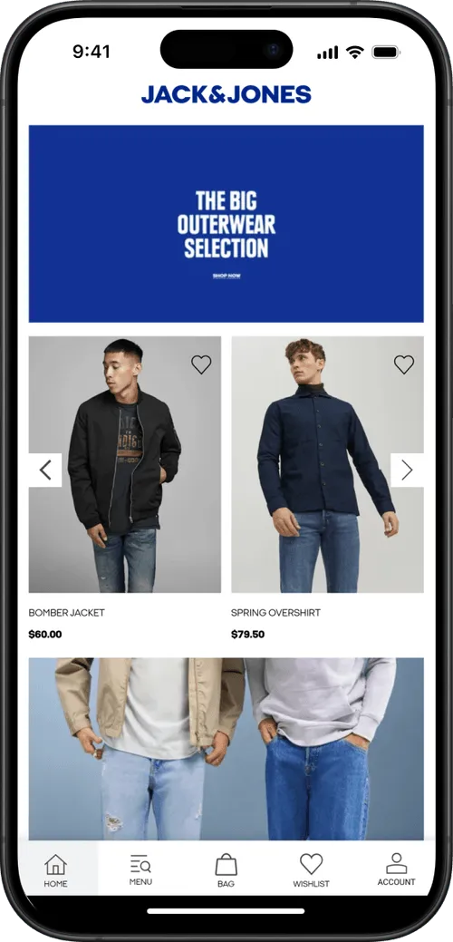
The splash screen is displayed as soon as you open your app, while the content is loading.
Below you can see some examples:
.png)
The final splash screen is built based on two different graphics, with the following specs:
- Logo: PNG file with 1000x1000px and your logo in the center
- Background: PNG file with 2248x2248px, no transparencies
The graphics are merged, with the logo being placed over the background, as you can see below:
.png)
Here are a few tips on how to make your splash screen look great:
1 - Leave space around your logo
When preparing your graphic for the logo, make sure to keep some spacing on the sides of your logo. We recommend adjusting the width of your logo to 700px, so there is enough spacing on the sides, see below:
.png)
The final result will be much better if you leave space on the sides, as you can see below:

2 - Don’t use text in your background
The splash screen background will get cropped depending on the size of the device where the app is being used. An iPad will display more elements of your background, while an iPhone will display fewer elements.
With that in mind, we highly recommend that you avoid using text and other elements that must be fully visible in order to look good or to make sense to the user.
3 - Keep it simple
Keeping your splash screen simple is key to achieving a good-looking final result, in most cases, a solid color background will do the job, but if you would like to use an image, make sure that there is enough contrast with your logo.
Templates
We have prepared a few template files to help you with preparing your app graphics, you can find them below:

