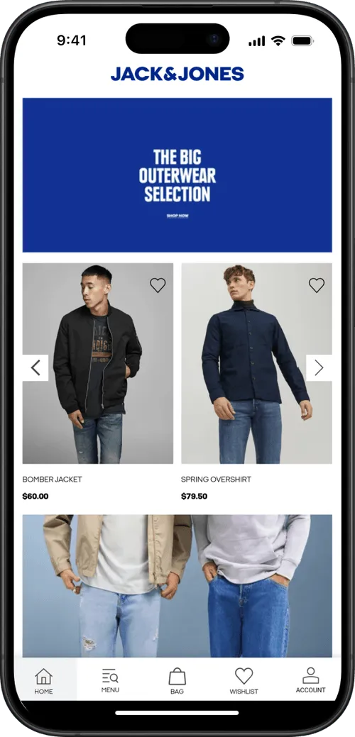
You always want users to have a smooth and enjoyable experience when using your websiter and app. The ability to navigate backwards plays a big role in that experience, specially in a hybrid solution like MobiLoud.
Website users are already familiar with the browser back feature, and to keep that experience consistent in the app, you can enable a floating back button that will allow your app users to easily navigate to the previous page in a smooth and familiar manner.
Why a Back Button is Essential for Your App
- Intuitive navigation: People are used to having a back button in mobile apps. It's a familiar way to move between pages, making your app feel user-friendly and polished.
- Increased engagement: A smooth back-and-forth flow encourages shoppers to explore more of your site, boosting their chances of finding something they love.
Implementing the Floating Back Button in Your App
To enable the floating back button for your app you will need to edit your app's advanced configuration.
Look for the "Floating_Back_ Button" block, and make sure "Enabled_ iOS" and "Enabled_ Android" are set to true, as follows:
"Floating_Back_Button": {
	"Enabled_iOS": true,
	"Enabled_Android": true
}
Customization
You can customize several aspects of your floating back button, allowing you to match your branding and website design.
Below you can find a complete list of all the available settings:
Border_Radius
Description: Controls the roundness of the back button's corners. 0 creates square corners, while 90 makes them circular.
Example:
"Floating_Back_Button": {
	"Border_Radius": "90"
}
Drop_Shadow
Description: Determines whether to display a shadow behind the button or not. Use this when you don't want the button to blend into your website design.
Example:
"Floating_Back_Button": {
	"Drop_Shadow": true
}
Position_Vertical
Description: Determines the back button placemt on the Y-Axis. Possible values are "top" and "bottom".
Example:
"Floating_Back_Button": {
	"Position_Vertical": "top"
}
Position_Horizontal
Description: Determines the back button placemt on the X-Axis. Possible values are "left" and "right".
Example:
"Floating_Back_Button": {
	"Position_Horizontal": "left"
}
Spacing_Vertical
Description: Determines the inner vertical padding of the back button, the spacing between the icon and the top/bottom edge of the button.
Example:
"Floating_Back_Button": {
	"Spacing_Vertical": "10"
}
Spacing_Horizontal
Description: Determines the inner horizontal padding of the back button, the spacing between the icon and left/right edge of the button.
Example:
"Floating_Back_Button": {
	"Spacing_Horizontal": "10"
}
Icon
Description: Let's you choose between Font Awesome icons to be used in your back button. You can pick icons from the Font Awesome website here: https://fontawesome.com/icons
Example:
"Floating_Back_Button": {
	"Icon": "fachevronleft"
}
Icon_Color
Description: Determines the color of the icon. Use a HEX color value.
Example:
"Floating_Back_Button": {
	"Icon_Color": "#FFFFFF"
}
Dark_Mode_ Icon_ Color
Description: Determines the color of the icon when dark mode is enabled. Use a HEX color value.
Example:
"Floating_Back_Button": {
	"Dark_Mode_Icon_Color": "#999999"
}
Button_Background_ Color
Description: Determines the color of the icon when dark mode is enabled. Use a HEX color value.
Example:
"Floating_Back_Button": {
	"Button_Background_Color": "#FFFFFF"
}
Dark_Mode_ Button_ Background_ Color
Description: Determines the color of the icon when dark mode is enabled. Use a HEX color value.
Example:
"Floating_Back_Button": {
	"Dark_Mode_Button_Background_Color": "#222222"
}
Click_Effect
Description: Triggers a ripple animation when the back button is clicked. Possible values are "true" and "false".
Example:
"Floating_Back_Button": {
	"Click_Effect": true
}
Click_Effect_Color
Description: Determines the color of the effect that is triggered when the button is clicked. Use a HEX color value.
Example:
"Floating_Back_Button": {
	"Click_Effect_Color": "#FAFAFA"
}
Dark_Mode_ Click_ Effect_ Color
Description: Determines the color of the effect that is triggered when the button is clicked and dark mode is enabled. Use a HEX color value.
Example:
"Floating_Back_Button": {
	"Dark_Mode_Click_Effect_Color": "#FFFFFF"
}
Show_Button_With_Animation
Description: Displays the back button with a subtle fade-in animation. Possible values are "true" and "false".
Example:
"Floating_Back_Button": {
	"Show_Button_With_Animation": true
}
Hide_On_Scroll
Description: Hides the back button while the user is scrolling through the page, only shows up again once the user scrolls up. Possible values are "true" and "false".
Example:
"Floating_Back_Button": {
	"Hide_On_Scroll": true
}
Left_Padding
Description: Sets the width of the padding area to the left of the icon in the back button.
Example:
"Floating_Back_Button": {
	"Left_Padding": "10"
}
Right_Padding
Description: Sets the width of the padding area to the right of the icon in the back button.
Example:
"Floating_Back_Button": {
	"Right_Padding": "10"
}
Top_Padding
Description: Sets the width of the padding area to the top of the icon in the back button.
Example:
"Floating_Back_Button": {
	"Top_Padding": "10"
}
Bottom_Padding
Description: Sets the width of the padding area to the bottom of the icon in the back button.
Example:
"Floating_Back_Button": {
	"Bottom_Padding": "10"
}
Final code
  "Floating_Back_Button": {
    "Enabled_iOS": true,
    "Enabled_Android": true,
    "Border_Radius": "5",
    "Drop_Shadow": false,
    "Position_Vertical": "top",
    "Position_Horizontal": "left",
    "Spacing_Vertical": "10",
    "Spacing_Horizontal": "10",
    "Icon": "fachevronleft",
    "Icon_Color": "#333333",
    "Button_Background_Color": "#ffd966",
    "Click_Effect_Color": "#a0a0a0",
    "Dark_Mode_Icon_Color": "#333333",
    "Dark_Mode_Button_Background_Color": "#ffffff",
    "Dark_Mode_Click_Effect_Color": "#ffffff",
    "Click_Effect": false,
    "Show_Button_With_Animation": true,
    "Left_Padding": "0",
    "Right_Padding": "0",
    "Top_Padding": "0",
    "Bottom_Padding": "0"
  },
