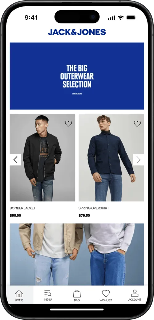
How to Use Micro-Interactions in Mobile Apps to Reduce Cart Abandonment

Micro-interactions, like progress bars, animations, and instant feedback, make apps feel smooth, human, and trustworthy. Done right, they cut cart abandonment, boost engagement, and strengthen loyalty.
Micro-interactions, like progress bars, animations, and instant feedback, make apps feel smooth, human, and trustworthy. Done right, they cut cart abandonment, boost engagement, and strengthen loyalty.
If you run an online store, you’ll know that cart abandonment is a massive opportunity to increase revenue.
Over 70% of shopping carts are left abandoned. That’s a lot of new revenue, if you can convince even a small percentage of these people to finish their purchase.
Where does cart abandonment come from? It’s partly from intent & indecision, but more often it’s friction. A confusing step, a lack of feedback, or an experience that feels cold and uncertain can be enough to push people away.
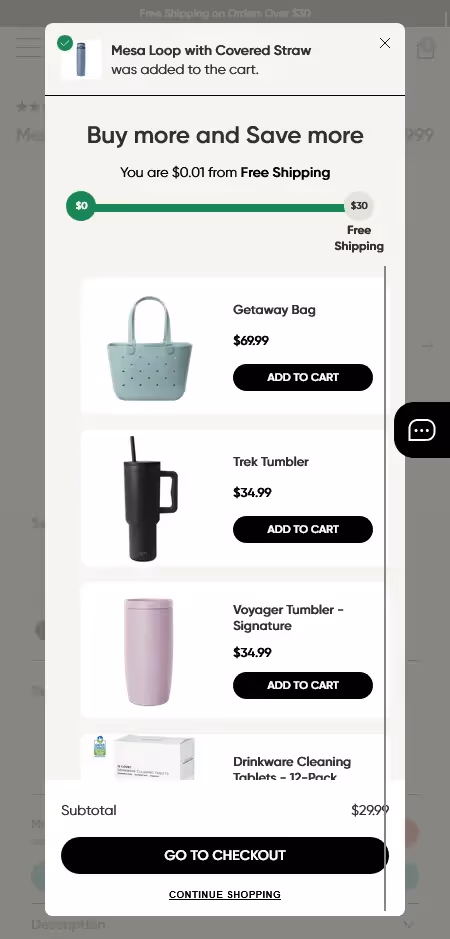
That’s where micro-interactions come in. These tiny design details, like a progress bar showing checkout steps, a subtle vibration when a button is tapped, or a quick animation confirming an item was added, make the app feel alive. They reassure, guide, and build trust in the moment.
Small as they are, micro-interactions shape confidence. And confidence is what gets customers through checkout instead of abandoning their carts.
What Are Micro-Interactions?
In app design, it’s often the smallest details that make the biggest difference. Micro-interactions are those tiny responses that happen when a user does something; tap, swipe, scroll, type.
Think of a progress bar filling as you complete a form. A heart animation when you “like” a post. A soft click sound when you send a message.
None of these are big features, but they provide instant feedback that says, yes, the app heard you.
They guide, reassure, and keep people engaged. In fact, they’re so woven into everyday apps that most users barely notice them. Yet they play a huge role in how smooth and human the overall experience feels.
Why Micro-Interactions Matter
Imagine tapping “Add to Cart” and… nothing happens. No animation, no vibration, no feedback at all. Most people would assume the app is broken and walk away.
That’s the power of micro-interactions. These small touches confirm that something worked, guide users through each step, and reduce the uncertainty that makes people hesitate.
They also add personality; a playful bounce, a subtle vibration, even a cheerful animation can turn mechanical steps into moments that feel alive.
And that matters. Because when users trust the app and enjoy the process, they’re far more likely to finish their purchase instead of abandoning it.
How Micro-Interactions Reduce Cart Abandonment
Cart abandonment usually comes down to doubt, confusion, or impatience. Micro-interactions tackle all three by giving shoppers confidence at every step.
- Progress indicators show exactly how many steps are left in checkout, cutting uncertainty.
- Instant feedback on payment details reassures customers that everything went through correctly.
- Small animations, like an item sliding smoothly into the cart, confirm actions and add a touch of delight.
Each of these moments is tiny on its own. But together, they build a smoother journey where shoppers feel guided, supported, and encouraged to finish the purchase instead of bailing halfway.
Read more: 15 Ways to Reduce Cart Abandonment in Your Store
The Business Benefits of Micro-Interactions
Micro-interactions may be tiny, but they deliver big results when woven into your app with intent. Here’s how they move the needle:
Real-Time Feedback Builds Trust
Loading icons, checkmarks, and confirmations keep users in the loop. When people know what’s happening, they stick with the process instead of dropping out.
Higher Engagement Through Delight
A confetti pop after checkout or a subtle vibration when a task is done makes the experience rewarding. These little wins keep users exploring and coming back.
Seamless Flows, Happier Users
Typing indicators, form validations, and checkout confirmations tie the whole experience together. The app feels smoother, faster, and easier to use.
Fewer Errors, Less Frustration
Highlighting a wrong field or giving immediate correction saves users from wasted time—and keeps them moving forward instead of giving up.
Showcasing Brand Personality
A playful bounce, cheerful sound, or branded animation can make your app feel distinct and alive. Personality matters in crowded markets.
Stronger Emotional Connection
When micro-interactions feel human, they build trust and loyalty. Over time, these small touches create bonds that turn first-time buyers into repeat customers.
Micro-Interactions vs Micro-Animations
These two terms get mixed up a lot, but they’re not the same thing.
- Micro-interactions are functional. They’re the small responses that guide a user; like a progress bar filling, a form error turning red, or a checkmark appearing when a task is done. Their job is clarity and confidence.
- Micro-animations are emotional. They bring personality; like a playful bounce, a character flying across the screen, or a subtle shimmer. Their job is to add delight and style.
The best apps don’t choose one or the other. They combine both: functional micro-interactions that keep things smooth, paired with micro-animations that make the journey memorable.
The Core Elements of Great Micro-Interactions
Every smooth micro-interaction is built on a simple structure. Here are the building blocks that make them work:
1. The Trigger
It all starts with an action – like a tap, swipe, or scroll – or a system event, like a notification or reminder.
2. The Rules
Rules define what happens after the trigger. Swipe left on a message? It archives. Tap the cart? It opens. Clear rules keep the app predictable.
3. The Feedback
This is the user’s confirmation. A checkmark, vibration, sound, or animation shows the action was received. Without it, users feel lost.
4. Loops and Modes
Loops define how long the interaction continues, like a progress bar filling until checkout is done. Modes adjust based on context; different responses for errors versus successes.
When these four elements work together, micro-interactions feel invisible in the best way: natural, intuitive, and reassuring.
Best Practices for Designing Micro-Interactions
Good micro-interactions don’t happen by accident—they’re intentional, consistent, and tuned to real user behavior. Here’s how to design them well:
Understand your users
Study where people hesitate, get confused, or need reassurance. That’s where micro-interactions make the biggest impact.
Give instant, clear feedback
Every action should trigger an immediate response; a progress bar, a vibration, a checkmark. Users should never wonder, did that work?
Keep it simple
Micro-interactions should reduce friction, not add flair for its own sake. Clarity beats complexity every time.
Stay consistent
Use the same style of cues (colors, motions, tones) across your app. Predictability builds trust.
Add a human touch
The best interactions feel warm, not mechanical. A cheerful bounce, a soft sound, or subtle haptic feedback makes the experience more memorable.
Examples of Micro-Interactions in the Wild
The best way to see the power of micro-interactions is through real-world examples. Leading brands use them to guide, delight, and reassure users at just the right moments. Here are a few standouts:
Facebook – Emoji Reactions
Instead of a plain “like,” Facebook added animated emoji reactions. They give users a playful way to respond while instantly showing that their tap registered. It’s simple feedback that also strengthens emotional connection.
Asana – Celebratory Characters
In Asana, completing a task sometimes triggers a unicorn or playful creature flying across the screen. It’s a small, joyful moment that turns routine work into something motivating.
Porsche – Interactive Car Configurator
Porsche’s car builder updates instantly as you change colors, wheels, or features. The smooth feedback reassures customers that their choices are applied correctly, making customization feel confident and fun.
Dropbox – Smooth Upload Progress
Dropbox uses a clear, calming progress bar to show file uploads in motion. Instead of leaving users wondering if it’s working, the animation reduces anxiety and builds trust.
Google Assistant – Responsive Dots
When you speak to Google Assistant, the floating dots move in real time with your voice. It’s subtle but powerful. It tells you the system is listening and responding, building confidence in the interaction.
Adding Micro-Interactions to Your Mobile App Without the Headaches
If you're running an ecommerce store, adding micro-interactions in your app can be tricky.
For one thing, if you want to add things like progress bars, checkout animations, or “add to cart” feedback in your website as well, you often end up with inconsistencies between website and app.
And then, with a lot of no-code tools, these powerful interactions won't even work in your app.
This is just one reason why MobiLoud is the best way to build your app.
MobiLoud fully converts your ecommerce site into an app. In doing so, it preserves all the custom micro-interactions you've designed and implemented on your site.
You don't need to accept a watered-down version of your web experience. The app takes all the best parts of your website, and adds the best parts of a mobile app, for the best possible experience for your app users.
And it's fully synced with your site, meaning if you update or improve these interactions on your site, you don't need to go in and update the app separately.
That's why MobiLoud is the best way to build an app that drives stronger retention, more long-term revenue, and keeps you workflows agile and optimized.
Want to see what's possible with MobiLoud? Get a free preview of your app now
Final Thoughts
Micro-interactions may look small, but they have an outsized impact. They guide users, reassure them, and add personality to your app, turning friction into flow.
When checkout feels smooth and intuitive, shoppers are less likely to abandon their carts. And when the experience feels alive and human, they’re more likely to come back.
The takeaway: get the details right. Because in mobile apps, it’s often the tiniest touches that decide whether a customer completes the purchase, or walks away.
Frequently Asked Questions
Can too many micro-interactions hurt app performance?
Yes. Overuse can clutter the interface and slow things down. Keep them simple and purposeful.
How do you measure the ROI of micro-interactions?
Track metrics like cart abandonment rates, task completion, and engagement. If those numbers improve, your micro-interactions are working.
What’s the difference between a micro-interaction and an animation?
A micro-interaction gives functional feedback to a user action. An animation adds style or emotion. The best apps use both together.
Do micro-interactions improve accessibility?
When designed well, yes. Multiple feedback cues (visual, haptic, or sound) make apps clearer and more inclusive.
Are micro-interactions only for mobile apps?
Not at all. They’re just as powerful in web design and anywhere users interact with a digital interface.
FAQs
Convert your website into a mobile app