Best Practices for Mobile Ecommerce Sites

- This article shares a list of the most vital mobile eCommerce best practices to maximize your website's UX for mobile users.
- These best practices cover site speed, UI and UX best practices, and how to effectively manage your mobile eCommerce website.
- The mobile commerce market is expected to reach more than $700 billion in the next few years, making mobile eCommerce optimization a top priority.
Mobile is quickly becoming the favorite way for most people to shop, overtaking physical retail and traditional eCommerce. If you haven’t yet embraced mobile, you’ll quickly fall behind.
Your site needs to be optimized for mobile commerce now, not later. The tips and best practices in this post show you how.
Did you know that mobile app users spend more, shop more frequently, and convert at a 3x higher rate than mobile web users? Check out our eCommerce App Revenue Calculator to see just how much you stand to gain by launching an app.
15 Best Practices for Mobile Ecommerce Websites
If you’re an eCommerce site owner, you need to follow these best practices if you want to get the most out of your mobile visitors.
These mobile eCommerce best practices are broken down into four categories.
- Technical best practices, which cover the backend of your site.
- UI best practices, covering the look and feel of your store on mobile devices.
- UX best practices, which is how the user journey functions for mobile users.
- Operational best practices, regarding how your business approaches mobile optimization.
Let’s get into it.
Technical Best Practices
Here are a few technical best practices to follow for mobile eCommerce websites.
1. Make sure your site is fast
Speed is the first, and possibly most important thing when it comes to mobile optimization.
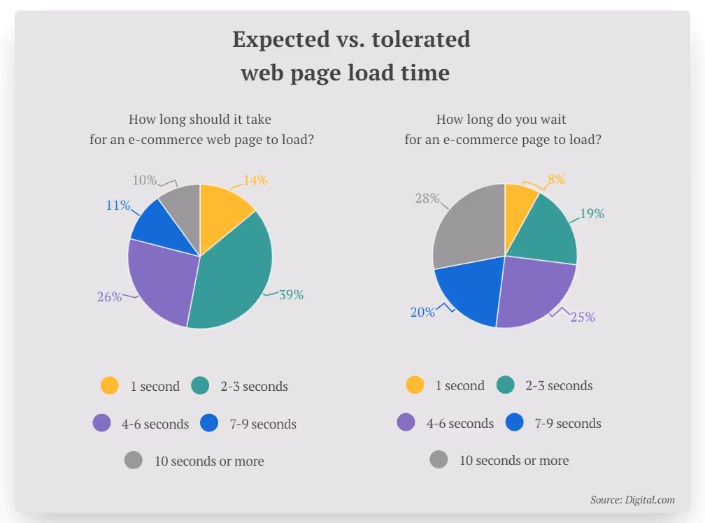
53% of website visitors expect an eCommerce site to load in 3 seconds or less. On top of that, 1 in 2 online shoppers will abandon their cart if the website they’re on is slow to load.
We expect things online to happen instantly, or at least close to it. The benchmark for site speed has shortened massively since the dial-up age.
These statistics are for all website visitors, mobile and desktop. We can assume that users’ expectations are even shorter on mobile, where convenience is prioritized.
Mobile devices have less processing power than desktop and laptop PCs as well, so if you don’t take care to optimize your site speed, it’s going to be a tough time for your mobile visitors. You can guarantee that these people will jump ship and go somewhere else if they have to wait too long.
2. Optimize your images
Large image files are one of the most common reasons for a slow website. If you have site speed problems, start here.
Try using a plugin or app to scale down your image files, as well as using a CDN and lazy loading to further optimize speed.
The right image formats matter too. WebP images are optimal for mobile devices, with file sizes 25-34% smaller than JPGs.
Mobile UI Design Best Practices
Now let’s look at some best practices to follow for UI (user interface) design for mobile eCommerce websites.
3. Use space effectively
When you’re dealing with a smaller screen size, how you use space is vital.
A lot of poorly designed mobile UIs make one of two mistakes. They either try to squeeze too much onto the page, making the UI messy and cluttered on a smaller screen, or they go the other way and leave huge pockets of empty space, glaringly obvious when you’re on a small screen.
You need to find an ideal balance between too much and not enough white space. Enough space to let the design breathe, but not so much that your attention is drawn to the space, instead of the content.
Space is particularly important around clickable elements. Misclicks (or mistaps) are extremely frustrating - you mean to tap on one button or element, but end up hitting a different one and going to the wrong place. The result of a mistap can be so frustrating it causes the visitor to leave your site altogether.
Allow enough space between buttons and clickable elements (e.g. dropdowns, clickable labels, close buttons on modals/popups) to avoid mistaps and make things easy for your visitors.
4. Pay close attention to hierarchy
When you convert a desktop site to mobile, make sure you wind up with the correct hierarchy.
On desktop, you might have several pieces of information on one screen - e.g. filters, results and sorting criteria on category pages, or images and product information on a product page.
Yet on mobile, this will be condensed to where the user sees one part of the page and sees more as they scroll. With this setup, it’s important that the order of the elements on the page (i.e. the hierarchy) is correct.
You don’t want your product page to show sizing information first, then the Add to Cart button, then related products, then the actual product images and name. This can easily happen if you rely on automatic mobile responsiveness provided by your theme or eCommerce platform.
You need to put greater importance on the area above the fold in a mobile UI. This space is limited, and you need to grab your visitor’s attention right away. On product pages, for instance, you’ll usually want your images to show first, then pricing and product information.
I always like to default to how Amazon does things when looking at eCommerce website best practices. See how their product pages make good use of visual elements first, before sizing, product information, pricing, etc.

5. Put search bar above the fold
Your UI needs to make it easy for visitors to get where they want to go. That's why your website's search functionality is key.
On your homepage in particular, make sure you’ve got a search function and that it’s prominent and easy to find without having to scroll.
On mobile, people will go straight for the search more than desktop, where they may be more likely to use the main navigation to find what they want. If the search function is hidden too deep, you’re going to lose some people right away.
6. Enable touch interactions
It’s important to embrace the differences that come with mobile touch screens. The way you navigate and perform actions on a touch screen is vastly different to using a mouse and keyboard.
Work these differences into your mobile UI design. Let users swipe between images. Enable pinch and double tap gestures to zoom in on product images.
Feedback for tappable elements is another plus, such as a tiny vibration when the user hits something interactive (e.g. a call to action button).
On the flipside, get rid of any interactions that don’t make sense on a touch screen, such as hover animations, replacing them on mobile with something more touch-friendly.
7. Prioritize one-handed interactions
We know a lot about user behavior on mobile devices, and e-commerce sites should use this information to provide a more convenient UX.
For one thing, 61% of people between the ages of 18 and 34 say it’s important to be able to use a website with one hand.
We’re conditioned to using our phone with one hand, while using the other hand for something else (holding a drink, scratching your head, etc). Most people cradle the phone with four fingers and use their thumb to interact with the content.

Clickable or tappable elements should always be within reach of the user’s thumb. It gets frustrating for the user if they constantly need to adjust their hand placement to interact with your site. This can lead to people abandoning your site and going to a competitor with a better mobile UI.
Mobile UX Design Best Practices
Now let's run through a few of the most important mobile user experience design best practices.
8. Customize menus & navigation for mobile
Your menus and navigation will need to be changed up for mobile. We’ve mentioned already that it’s extremely frustrating when the visitor can’t get where they want to go, which is not always obvious on mobile websites.
Most eCommerce sites’ desktop menus rely on hover animations, which is one thing that needs to change on a mobile device. But fitting all this information into a smaller, touch-optimized menu can be difficult.
You’ll most likely want to use a hamburger menu on mobile to replace this. This must be clean, intuitive and easy to navigate.
The main nav menu is also permanently visible on most desktop sites, whereas this doesn’t make sense for mobile screens. You’ll want to provide some kind of breadcrumbs or mini navigation on product pages to make it easy for users to go back or get around after they view a product.

9. Make important pages easy to reach
Staying on the top of navigation, certain parts of your site, such as the home page, account and cart/checkout need to be easily and obviously reachable.
The more you make people think about how to find these areas, the more likely they’ll abandon your site. This can be disastrous. If a user’s already added products to their cart and they want to check out, you need to make it as easy for them as possible.
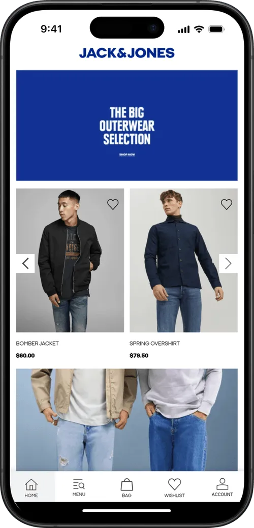
The cart, checkout and home pages should all be reachable from any page, in one click. An app-like bottom menu is a great way to achieve this on mobile, as in this example from VERO MODA:

10. Minimize and optimize text inputs
Typing is more time-consuming on mobile, so you want to minimize the need for text inputs wherever possible.
You will need text inputs in some places, so enable autocomplete and auto suggest to make this smoother and faster.
On top of this, make text inputs easier by optimizing the keyboard for the type of input. If the input is numerical, such as a phone number or credit card details, show a numeric keyboard to make this faster and more intuitive for the user.

11. Simplify the checkout process
Reducing friction in your checkout flow is one of the most effective ways to improve your mobile user experience.
Checking out is usually more difficult and more frustrating on mobile, which is probably why the average conversion rate on mobile eCommerce sites is half the average CVR on desktop.
So how can we make this easier? Minimizing the amount of text input needed is one thing. Allow users to create an account and save their details and don’t ask for any unnecessary details - or at least, make these fields optional (and make it clear what’s optional and what’s required).
Consider adding a progress bar to your checkout flow, to make it clear how far the user is through the process.
You should also give users the option to save their cart and finish the checkout process on desktop, which a lot of mobile shoppers prefer to do.
12. Integrate with mobile payment solutions
Another way to drastically improve your checkout flow is integrating with payment methods like Google Pay, Apple Pay and PayPal.
These payment options not only make it easier for users to check out and pay, they also increase trust and decrease the hesitancy shoppers feel about giving over their card details to a site they don’t know.
Operational Best Practices
Finally let’s touch on a few more holistic tips regarding how you approach mobile optimization for your eCommerce store.
13. Keep it consistent across mobile and desktop
Though you definitely need to change things up for mobile, ultimately your mobile and desktop sites should still look and feel consistent.
Your store shouldn’t look completely different depending on what platform you view it on. The branding should be the same, and the navigation and site structure should be very similar too. You’ll have some customers who initially find you on one platform, shop around a bit, and come back later on another platform, so make it easy for them to get around and orient themselves.
It should come as a given that product information and backend data - pricing, user logins, cart and order information for example - should all be the same for mobile and desktop too.
14. Design for mobile first
With many sites now serving more mobile users than desktop, it makes increasing sense to switch it up from the traditional way we design websites and design for mobile first.
It makes perfect sense to build primarily for whichever segment makes up a majority of your users. And it’s easy to tell a site built with mobile users front of mind, versus a desktop site squeezed into a mobile screen.
15. Turn your site into an app
As much effort as you put into mobile optimization, there’s a limit for how much you can achieve while working within the browser.
If you're really serious about mobile eCommerce, you need an app.
An app lets you make full use of the limited screen size on mobile by removing the outline of the mobile browser. This also removes the distraction of other sites open in other tabs, which lead to users abandoning their carts or leaving your site without making a purchase.
Having an app also gives you full use of push notifications (the most powerful and most cost-effective communication channel for eCommerce), provides a big boost in key metrics like average order value, conversion rate, and retention, and lets you get your brand into the app stores.
You don’t need to go all out and create a custom app from scratch. Just converting your mobile website, assuming you’ve followed all the mobile eCommerce best practices listed above, is enough to provide an awesome app experience.
The State of Mobile Commerce in 2026
The mobile commerce market is currently worth over $400 billion in the US. Mobile commerce sales are projected to reach $710 billion within the next two years.
M-commerce is growing at a huge rate. The increased convenience is leading to more users, who spend more and shop more often.
It’s not just eCommerce, it’s prevalent across the entire web. More internet traffic today comes on mobile than desktop, over 60% of Google searches happen on mobile and 15% of Americans only use smartphones to go online.
Today, you can’t afford not to be mobile-friendly and mobile-optimized. If you’re offering a sub-par mobile user experience, you’re basically disregarding half (or more) of your audience.
On top of this, the standard for mobile-optimized websites is constantly going up, so what would have felt like a mobile-friendly site a few years ago may now be significantly below average.
Ignoring mobile commerce today is like being a physical store and ignoring eCommerce ten years ago. Don’t be left behind.
Launch an App to Maximize Mobile Revenue
The best way to fully optimize your business for mobile commerce is to launch an app.
Most people prefer to go online and shop using apps. We spend 90% of our time online on mobile using apps, over browsers. They just offer a better user experience.
App users spend more time in your store, they view more products (4.2x more per session), they convert at a higher rate (3x higher than mobile websites), and spend 10% more per order.
Best of all, app users are much more likely to come back and shop again, since you have a direct line to a customer when they install your app on their phone.
Mobile commerce apps are the best way to capitalize on the mobile shopping boom, and provide a mobile e-commerce experience that reflects well on your brand.
How to Do It (Without Spending Megabucks)
Custom eCommerce mobile apps can take hundreds of thousands of dollars to build, take up 6 months to a year of your time, and take a ton of money and effort to maintain.
But converting your eCommerce store into an app is easy and affordable with MobiLoud.
MobiLoud converts your mobile site and all its features into Android and iOS apps, with no technical work required on your end. Your apps and website will be 100% in sync, which means that any changes you make to your site relay automatically to your apps.
MobiLoud works with any eCommerce platform (including Shopify, WooCommerce, BigCommerce and any custom-built eCommerce sites) and lets you launch an app and get in the app stores in less than a month.
David Cost from Rainbow Apparel said of MobiLoud;
“The expense isn’t that big, and operationally, there’s not that much we have to do for the app. It’s a no-brainer, especially when you add push notifications on top. You’re essentially offering an app for free.”

If you add in the benefits of getting into the app stores and using push notifications to drive up revenue and retention, there’s zero reason not to launch your own app once you realize how easy it is to do this with MobiLoud.
Getting Started
To get an idea of how easy it is, get a free preview of your app and book a free, personalized demo. You’ll see how the process works and view a working preview of your app right away.
You’ll be shocked at how fast you can get a live mobile app that your users can download, and how little work it adds to your workflow.
Book a demo now and maximize your mobile commerce revenue today.
FAQs
Convert your website into a mobile app
