Ecommerce Product Detail Page Best Practices: The Complete Guide (2026)

A high-converting product detail page (PDP) combines high-quality visuals, benefit-driven descriptions, transparent pricing, social proof, trust signals, and mobile-first design. Most ecommerce sites get this wrong: only 49% deliver a good PDP experience, which means optimizing yours is one of the fastest ways to lift conversion rates without spending more on traffic.
A high-converting product detail page (PDP) combines high-quality visuals, benefit-driven descriptions, transparent pricing, social proof, trust signals, and mobile-first design. Most ecommerce sites get this wrong: only 49% deliver a good PDP experience, which means optimizing yours is one of the fastest ways to lift conversion rates without spending more on traffic.
Your product detail page is where buying decisions happen. It's the last stop before "Add to Cart" or the back button.
A shopper who lands on your PDP has already shown intent. They searched, clicked, browsed, and chose a specific product. Now they need enough information to commit, and they need it presented clearly, quickly, and on whatever device they're using.
The problem is that most PDPs fall short. Baymard Institute's research across hundreds of ecommerce sites found that only 18% of product pages earn a "good" or "acceptable" UX rating. The rest lose sales to preventable issues: missing size information, buried shipping details, slow load times, or product images that don't show what the customer actually needs to see.
This guide covers every element of a high-performing PDP, from visuals and copy to technical SEO and mobile optimization, with sourced data and real examples so you can audit your own pages and make specific improvements.
What Is a Product Detail Page (PDP)?
A product detail page is the individual page on an ecommerce site dedicated to a single product. It's where a shopper evaluates whether a product is worth buying.
In ecommerce terms, the PDP sits between the product listing page (PLP), which shows a category or search results grid, and the cart/checkout flow.
The PDP's job is simple: give shoppers everything they need to make a confident purchase decision. That includes:
- Visual confirmation (does this look like what I want?)
- Specification details (will it fit, work, or match?)
- Social validation (do other people recommend it?)
- Logistical clarity (when will it arrive, and can I return it?)
A PDP that answers all four of those questions converts. One that leaves gaps loses the sale to a competitor who answers them better.
Why PDP Optimization Matters More Than You Think
Improving your PDP conversion rate from 2.0% to 2.5% means a 25% revenue increase from the same traffic. No extra ad spend, no new campaigns. Just better pages.
Consider what's at stake:
- Cart abandonment starts here. When shoppers can't find the information they need (shipping cost, return policy, sizing), they leave before they ever reach checkout.
- Returns start here too. Vague descriptions, insufficient images, or unclear sizing lead to wrong purchases. Returns cost 15-30% of the item price to process and erode customer trust.
- SEO visibility depends on PDP quality. Google evaluates product pages for E-E-A-T (experience, expertise, authoritativeness, trustworthiness). Well-structured PDPs with rich content, reviews, and structured data earn better rankings and rich snippets.
- Mobile shoppers are less patient. Mobile commerce accounts for over 57% of all ecommerce sales, and mobile shoppers scroll faster, tap less precisely, and abandon more quickly when pages are confusing or slow.
The opportunity is real: most of your competitors have mediocre PDPs. Fixing yours is one of the highest-leverage things you can do.
The Essential Elements of a High-Converting PDP
Product Images and Video
Product imagery is the single most influential element on a PDP. 67% of online shoppers cite image quality as the top factor in their buying decision, more than product descriptions, reviews, or pricing.
What high-performing product images look like:
- 6-8 images minimum showing different angles, close-up details, and scale references
- Lifestyle shots showing the product in use (worn, styled, placed in a room)
- Zoom functionality so shoppers can inspect textures, stitching, materials, and finishes
- Consistent lighting and backgrounds across your catalog for a professional, cohesive feel
- Color-accurate photography to reduce returns from "it looked different online"
Video content is a conversion multiplier. Shoppers who watch product videos are 144% more likely to add a product to their cart. Product demos, 360-degree views, and styling videos give shoppers confidence that static images alone can't provide.
Nike does this well: their PDPs include large hero images, multiple angle shots, on-model lifestyle photography, and embedded video for key products, all viewable without leaving the page.
Note: Image SEO matters too. Use descriptive file names (blue-linen-blazer-front.jpg, not IMG_3847.jpg) and write alt text that describes the product for accessibility and search engines.
Product Titles and Descriptions
Your product title is the first piece of text a shopper reads, and it's what search engines use to match your page to queries. A good title is descriptive, specific, and includes the key attributes a shopper would search for.
Title formula: Brand + Product Name + Key Attribute (Color, Size, Material, Use Case)
Example: "Patagonia Better Sweater Fleece Jacket - Women's" works better than "Better Sweater."
For product descriptions, lead with benefits, then support with features:
- Open with 1-2 sentences explaining what the product does for the customer and why it matters
- Follow with a scannable bullet list of specifications (materials, dimensions, weight, compatibility)
- Use natural language, not marketing fluff. Nielsen Norman Group's research found that shoppers want "complete but not wordy" descriptions that prioritize substance over salesmanship.
Formatting tips:
- Keep the main description to 100-200 words
- Use bullet points for specs and features
- Add expandable/accordion sections for detailed information (care instructions, warranty, technical specs) to avoid overwhelming the page
- Include keywords naturally for SEO, but write for humans first
Pricing and Payment Options
Pricing transparency directly affects conversion. Unexpected costs, especially shipping, are the top reason for cart abandonment.
Best practices for PDP pricing:
- Show the final price clearly including any taxes or fees the shopper will pay
- Display shipping cost or free shipping threshold on the PDP itself, not just at checkout. "Free shipping over $75" is a conversion driver and an AOV booster.
- Show original and sale prices together with the percentage saved. Make the savings concrete: "$120 $160 (Save 25%)" is more compelling than just showing the sale price.
- Include buy now, pay later (BNPL) options. Services like Klarna, Afterpay, and Shop Pay Installments can increase conversion by lowering the perceived price barrier. Display the installment amount directly: "or 4 payments of $30 with Afterpay."
Variant Selection: Size, Color, and Customization
When a product comes in multiple variants (sizes, colors, materials), the selection experience can make or break the sale.
UX guidelines for variant selectors:
- Show all variants on a single page. Don't create separate URLs for each color or size unless there's a strong SEO reason to do so.
- Use color swatches, not dropdowns, for visual options. Shoppers should see available colors at a glance.
- Gray out or cross out unavailable variants rather than hiding them. Hiding options causes confusion ("I thought this came in blue?").
- Update the main product image when a shopper selects a new color or style variant.
- Display availability per variant. "Only 3 left in Medium" creates legitimate urgency without feeling manipulative.
Size Charts and Fit Guides
For apparel, footwear, and accessories, sizing uncertainty is one of the biggest conversion killers. A shopper who isn't sure about fit simply won't buy, or will buy multiple sizes and return the rest.
- Include a size chart on the PDP (accessible via a link or modal, not buried in a separate page)
- Add model measurements and what size the model is wearing
- Consider a fit recommendation tool (True Fit, Fit Analytics) that suggests a size based on body measurements or past purchases
- Include customer-contributed fit feedback: "Runs small," "True to size," "Runs large"
Call-to-Action Design and Placement
The "Add to Cart" button is the most important element on your PDP. Everything else on the page exists to get a shopper confident enough to click it.
CTA best practices:
- Place it above the fold on desktop, immediately visible without scrolling
- Use a sticky/floating CTA on mobile that follows the shopper as they scroll through product details
- Make it the most visually prominent element on the page. High-contrast color, large tap target (minimum 44x44px for mobile), clear label.
- Use direct language: "Add to Cart" or "Buy Now" converts better than clever alternatives like "Get Yours" or "Treat Yourself"
- Show a confirmation when an item is added. Either a mini-cart overlay, a slide-out drawer, or a clear notification. NN/g's research found that unclear add-to-cart feedback caused shoppers to either add items twice or believe items weren't added at all.
Trust Signals: Returns, Guarantees, and Security
Trust signals reduce purchase anxiety, especially for first-time customers and higher-priced items. They answer the subconscious question: "What if I don't like it?"
Include these on or near the PDP:
- Return policy summary (e.g., "Free returns within 30 days"). Don't make shoppers hunt for this on a separate page.
- Shipping and delivery estimate ("Arrives by March 28" or "Ships within 1-2 business days")
- Security and payment badges (SSL, payment provider logos, "Secure checkout")
- Satisfaction guarantee if you offer one
- Contact availability (live chat, phone number, or email) visible on the page
Place these near the CTA. Shoppers evaluate trust signals in the moments before clicking "Add to Cart."
Social Proof: Reviews, Ratings, and UGC
98% of online shoppers read reviews before making a purchase, and adding ratings and reviews to PDPs delivers a 32% average conversion lift.
Review best practices:
- Show the star rating and review count near the top of the page (next to the product title). Don't bury reviews at the bottom.
- Allow filtering and sorting by rating, recency, verified purchase, and relevance
- Include reviewer context: What size did they buy? What body type? How long have they used the product? This helps shoppers find reviews from people like them.
- Don't hide negative reviews. A mix of ratings actually builds more trust than a perfect 5.0. Shoppers are suspicious of products with only positive reviews.
- Respond to negative reviews publicly. It shows you're engaged and willing to make things right.
User-generated content (UGC) goes beyond text reviews. Customer photos and videos showing the product in real-life settings are more persuasive than professional photography for many shoppers.
A large number of ecommerce sites still lack buyer-generated visuals, which means adding UGC is a competitive advantage.
Platforms like Yotpo, Bazaarvoice, Loox, and Judge.me make it straightforward to collect and display customer photos and video alongside text reviews.
Cross-Selling and Product Recommendations
Product recommendations on PDPs typically increase average order value. Personalized recommendations can boost sales by up to 20% and profits by 30%.
Common recommendation patterns:
- "Complete the look" / "Frequently bought together" - Suggest complementary products (a belt with trousers, a case with a phone)
- "You may also like" - Show similar products in case the current one isn't quite right
- "Recently viewed" - Help shoppers navigate back to products they've already considered
Keep recommendation sections to 4-6 products. More than that creates decision fatigue rather than helpful guidance.
How to Optimize PDPs for Mobile
With mobile commerce representing 57% of ecommerce sales and growing, your PDP experience on a phone isn't secondary, it's primary.
Here’s what to consider for mobile shoppers.
Responsive Layout and Thumb-Friendly Design
Your PDPs should firstly adapt properly to mobile screens, and should also be easy to use for someone scrolling through their phone.
Mobile PDP design principles:
- Stack content vertically. On mobile, the natural flow is: image gallery > title/price > variant selector > CTA > description > reviews.
- Make tap targets large. Buttons, variant selectors, and interactive elements should be at least 44x44 pixels with adequate spacing between them.
- Use swipeable image galleries. Horizontal swipe for product images is an expected mobile pattern. Include a visual indicator showing how many images are available.
- Collapse secondary information. Use accordions for specs, shipping details, and care instructions to keep the initial view focused.
Sticky Add-to-Cart on Mobile
On longer mobile PDPs, the add-to-cart button scrolls out of view quickly. A sticky CTA bar at the bottom of the screen keeps the purchase action accessible at all times. Include the price and a compact CTA button in the sticky bar.
Page Speed and Core Web Vitals
Page speed directly affects both conversion rates and SEO rankings. Google's Core Web Vitals (LCP, CLS, INP) are ranking factors, and slow-loading PDPs lose shoppers before they see the product.
PDP-specific speed optimizations:
- Lazy-load images below the fold. The hero image should load immediately; gallery images can load as the shopper scrolls.
- Serve images in modern formats (WebP or AVIF) with responsive sizing (srcset) so mobile devices don't download desktop-sized files.
- Minimize layout shifts (CLS). Reserve space for images, variant selectors, and dynamic pricing before they load. Nothing frustrates shoppers more than the page jumping as they try to tap.
- Target LCP under 2.5 seconds. The Largest Contentful Paint is typically the hero product image on a PDP. Optimize it aggressively.
Technical PDP Optimization
Structured Data and Schema Markup
Product schema markup tells search engines exactly what your page contains and enables rich snippets in search results, including price, availability, star rating, and review count.
Essential schema types for PDPs:
- Product schema - Name, description, image, brand, SKU, price, availability, condition
- AggregateRating - Star rating and review count
- Offer - Price, currency, availability, price valid until
- Review - Individual review snippets
- BreadcrumbList - Navigation path to the product
Validate your markup with Google's Rich Results Test and monitor in Google Search Console. Products with rich snippets typically see higher click-through rates from search results.
SEO Best Practices for Product Pages
- URL structure: Keep it clean and descriptive. /products/blue-linen-blazer outperforms /products/item-38472.
- Title tag: Include the product name and a key attribute. "Blue Linen Blazer - Women's | Brand Name" is better than "Product Page | Brand Name."
- Meta description: Write a unique, compelling description for each product (under 160 characters) that includes the product name and a value proposition.
- Image alt text: Describe the product accurately for accessibility and image search. "Blue linen blazer front view with pearl buttons" is better than "product image."
- Internal linking: Link to related products, category pages, and buying guides from within the PDP. Breadcrumb navigation provides both UX and SEO value.
- Canonical tags: If a product exists under multiple categories or with different URL parameters (filters, tracking), use canonical tags to prevent duplicate content issues.
Accessibility and Inclusive Design
An accessible PDP serves more customers and meets legal requirements (ADA, WCAG 2.1). It also improves SEO since many accessibility best practices align with search engine optimization.
- Alt text on all images (already covered above for SEO, but critical for screen readers)
- Keyboard navigation for variant selectors, image galleries, quantity inputs, and CTA buttons
- Sufficient color contrast between text and backgrounds (minimum 4.5:1 ratio for body text)
- Form labels and ARIA attributes on interactive elements (dropdowns, size selectors, quantity fields)
- Video captions for product videos
Advanced PDP Strategies
Focus on getting the basics right first. But once that’s done, you can start thinking about how to elevate your PDPs even further.
A/B Testing Your Product Pages
The best practices in this guide are based on industry research, but your audience may respond differently. A/B testing lets you validate changes with real data instead of assumptions.
High-impact PDP elements to test:
- CTA button color, size, text, and placement
- Product image count and order
- Description length and format (paragraph vs. bullets)
- Review placement (above the fold vs. below description)
- Urgency messaging ("Only 3 left" vs. no urgency)
- Price display format (with/without BNPL messaging)
Tools like VWO, Optimizely, Google Optimize (sunset, but alternatives exist), and Convert handle PDP-level testing. Start with one variable at a time and run tests until you reach statistical significance.
Personalization and AI-Powered Recommendations
Generic "You may also like" sections are becoming less effective as shoppers expect personalized experiences. AI-powered recommendation engines analyze browsing history, purchase history, and real-time behavior to surface products each shopper is most likely to buy.
Platforms like Nosto, Rebuy, Klevu, and Shopify's built-in Search & Discovery app offer personalization that can be applied to PDP recommendation sections, recently viewed carousels, and dynamic bundles.
Fulfillment Transparency
Modern shoppers expect to know exactly how and when they'll get their purchase. On the PDP, this means:
- Estimated delivery date based on the shopper's location (not just "3-5 business days" but "Arrives by Thursday, March 28")
- Pickup options if you have physical stores (BOPIS: Buy Online, Pick Up In-Store)
- Same-day or next-day delivery availability for local shoppers
- Subscription/auto-replenishment options for consumable products
Product Page Examples That Convert
Nike

Nike's PDPs are a benchmark for visual merchandising. Key elements: large, zoomable hero images; on-model and flat-lay shots; integrated video; expandable sections for details, shipping, and reviews; clear variant selectors for size and color; and a prominent "Add to Bag" CTA. They also include "Complete the Look" cross-sells with styled outfit suggestions.
Allbirds
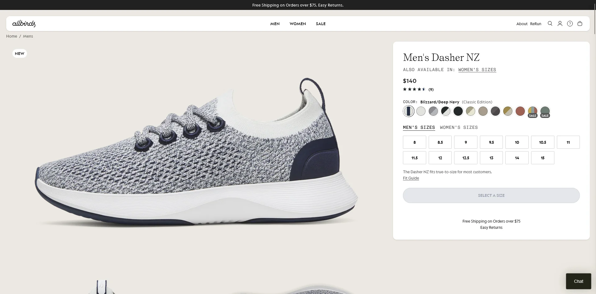
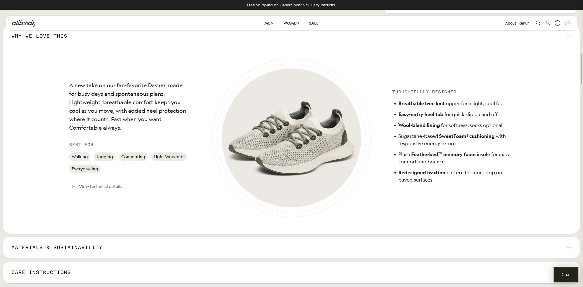
Allbirds keeps their PDPs clean and focused. Highlights: sustainability messaging woven into the product story; customer reviews with fit feedback ("Runs true to size"); a "Find Your Size" tool; and a limited, curated color palette that reduces decision fatigue. They lead with benefits (comfort, sustainability) rather than specs.
Glossier
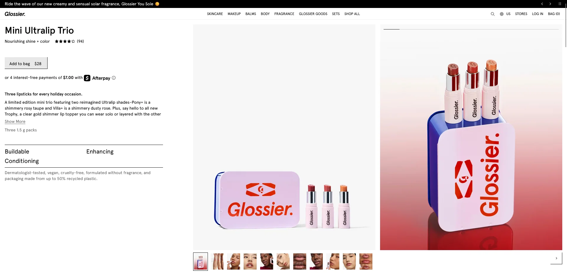
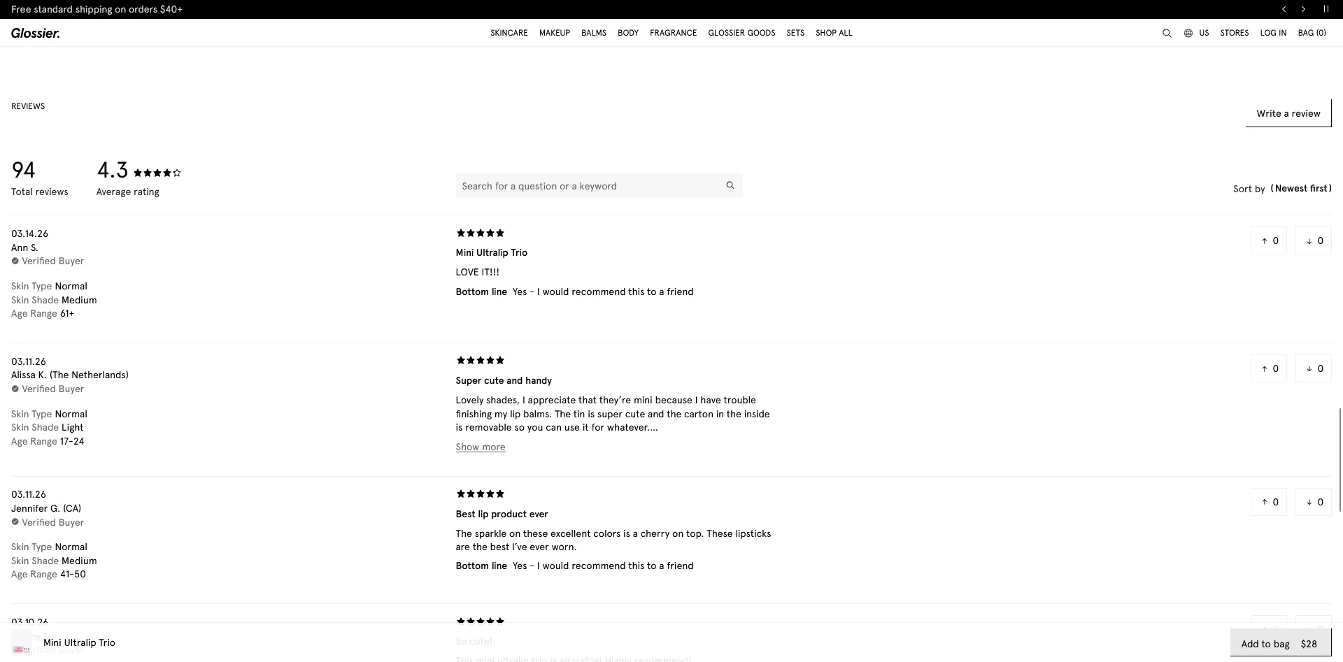
Glossier's PDPs showcase the power of community-driven social proof. Their review section lets shoppers filter by skin type and concern, making reviews personally relevant. They bundle products with clearly communicated savings and embed lifestyle UGC throughout the page.
PDP Optimization Checklist
Use this checklist to audit your own product pages:
Visuals
- 6+ product images including multiple angles
- Lifestyle/in-use photos
- Zoom functionality
- Product video (demo, 360-view, or styling)
- Descriptive alt text on all images
Product Information
- Descriptive product title with key attributes
- Benefit-driven description (100-200 words)
- Scannable specs in bullet format
- Size chart or fit guide (apparel)
- Expandable sections for detailed info
Pricing and Payment
- Clear pricing above the fold
- Sale price with savings shown
- BNPL/installment options displayed
- Shipping cost or free shipping threshold visible
Trust and Social Proof
- Star rating and review count near the top
- Filterable, sortable reviews
- Customer photos/UGC
- Return policy on or near the PDP
- Security/payment badges near CTA
Conversion
- Prominent, high-contrast CTA above the fold
- Sticky CTA on mobile
- Clear add-to-cart confirmation
- Cross-sell/recommendation section (4-6 products)
- Wishlist option
Technical
- Product schema markup (validated)
- LCP under 2.5 seconds
- No layout shift on images or dynamic content
- Unique meta title and description
- Breadcrumb navigation
- Canonical tags set correctly
- Keyboard-navigable interactive elements
Bringing Your PDP Experience into a Native App
You’ve been through this whole guide, and put together bulletproof, high-converting PDPs that have totally transformed your business.
But your website isn't the only surface where people buy from you. Another crucial channel: your mobile app.
The problem? With most mobile apps, all the painstaking work to optimize your website’s PDPs don’t carry over to your app.
If you’re using a classic Shopify mobile app builder, for example, your app exists as a separate storefront, and your highly optimized PDPs turn into stock, templated PDPs for app users.
The solution? MobiLoud.
MobiLoud directly converts your entire site into a mobile app. That means all your PDP optimizations carry over, automatically.
When you make changes to your site, your app updates with it. No extra work, no juggling separate platforms.
It’s by far the best way to launch a mobile app, if your site relies on a lot of in-depth customizations and improvements that have stacked up over years of work.
Want to see what your app could look like? Get in touch and book a free consultation and we’ll show you, along with a full breakdown of how MobiLoud can help you go live with the perfect, low-lift mobile app, in just 30 days.
FAQs
Convert your website into a mobile app
