How to Design Mobile-Friendly Ecommerce Websites (With Examples)


What makes a mobile-friendly website? How can you ensure that your website is fully optimized for mobile users? Is it even that important to put effort into your mobile website, if using a mobile app is the preference for both you and your users?
These are all questions we’ll address in this article. Read on for everything you need to know to make sure you cover all the bases of mobile optimization for your e-commerce website.
Quick Summary:
- Optimizing your site for mobile is the first thing you should do, before you think about building an app.
- Mobile-friendly sites are easy and intuitive to use on smartphones, and optimized to convert mobile shoppers into buyers.
- Mobile optimization requires a number of key principles to be followed, including optimal spacing, placing key details above the fold, intuitive navigation and checkout flow and touch-friendly buttons and clickable elements.
This video goes into some of our top tips on mobile website optimization. Give it a watch, then keep reading for more:
Why Mobile Web Optimization is Your First Priority
First of all, how important is it to have a mobile-friendly, mobile-optimized website? Particularly if you want to get users on your app eventually anyway?
It’s true that you ultimately want to convert website visitors into app users, where they’re likely to spend more in each shop and much more likely to become repeat customers. However, your first step should always be optimizing your mobile website.
There are three reasons for this.
#1: More people will discover your store via the web
In all likelihood, when someone enters your online store for the first time, it’ll be via the web. Whether they come to you via social media ads, Google or any other channel, it’ll be the website they land on. And there’s a strong chance that this happens on mobile.
You need to be set up to offer the best possible user experience for these web visitors. In time, you’ll ideally be able to get them on the app. But for now they’re on your website, and you risk losing these customers if your web user experience is not optimal.
#2: Some users simply won’t download the app
Despite your best efforts, not all your customers will download your app when you launch it. You’ll get repeat customers who don’t want to download an app, but they’ll still shop on your mobile store.
Don’t cast these customers aside just because they don’t want to use the app. Provide a great mobile user experience for them and maximize the revenue you get from each customer, no matter where they shop.
#3: It’s easier to convert your site into an app
As mentioned in the previous article, e-commerce sites are easy to convert into apps, as long as they’re optimized for mobile already.
It’s far more difficult to build an app for your site if it’s not already mobile-friendly. It’ll require you to do the same work you’d do to optimize your website for mobile in the first place.
Think of this as two birds with one stone; you’re designing your mobile app, and at the same time building a user experience that’s going to boost revenue and retention for web users.
What Makes a Website Mobile-Friendly?
There are varying degrees to which a website can be considered mobile-friendly. There are also tools that can test this, such as Google’s mobile testing tool.
These tools generally just test that a site is usable on mobile and that there are no significant issues, like anything that’s completely broken on mobile.
But to be truly mobile-friendly or mobile-optimized, your website should not just be usable on mobile, it should provide an excellent experience for people who come to your site on mobile.
It should:
- Be easy and intuitive to browse the site.
- Feel like it’s made with mobile users in mind.
- Be optimized to hold the attention of mobile users.
- Be optimized to convert mobile users into buyers.
- Follow key mobile UX and SEO principles.
We’ll show the specifics on how to do this next.
Key Elements of Mobile-Friendly E-Commerce Sites
Here are some specific tips and best practices to follow to ensure your website is fully optimized for mobile users (and thus also in the best state to convert to an app).
Responsive to Screen Size
Your site should look good and be usable on a number of different resolutions. From tablets and smartphones, to different smartphone models, there are many screen sizes you need to cater to.
It’s not great if your site looks fine on an iPhone 13, but awful on a Samsung Galaxy.
Clear Images
It’s easy for images to look bad or unclear when scaled down to smaller screen sizes. With the shorter attention span of mobile users and lower reliance on text for mobile websites, it’s even more important that your images are not only clear, but that they really stand out on smaller screens.
Text That’s Easy to Read
As with images, ensure that text is clear and easy to read on smaller screens. Text can get scaled down for mobile to where it becomes too small and hard to read.
On the other hand, text should not be so big that it forces a horizontal scroll or gets cut off (this is common with headlines in particular).
Large blocks of text are also suboptimal on mobile. You may need to increase spacing, break up text or perhaps avoid large blocks of text altogether to best serve mobile users.
Optimal Use of White Space
Your page layout on smaller screens should have enough white space, but not too much.
Common with poorly optimized mobile websites is either large blocks of empty space, or content areas that stretch to the very edge of the screen and don’t have enough white space.
Your site, specifically areas with text, should use just the right amount of negative space.
Key Information Above the Fold
With less visible on the screen, and more scrolling necessary to view the entire page, you need to ensure that the most important information is available above the fold, or at least high up on the page with minimal scrolling necessary.
For e-commerce websites, this means putting product images, critical product information and CTAs early in the page.
Smooth Navigation
Navigation and menus may need to work differently on mobile. You won’t have room to display the full menu at all times, as you might do on desktop. As you’re dealing with touch screens, hovering to show sub-items on the menu won’t work.
Yet it’s even more important on mobile that you give users a smooth process to navigate between pages and get to where they want to go. Make sure important pages, such as the checkout, collections and account are easy to find and easy to get to.
Fast Load Speed
People today want websites to load instantly - particularly on mobile, where speed and convenience is more important to users.
With each second of load time, website conversion rates drop by an average of 4.42%. And nearly 70% of customers become less likely to buy if a site loads slower than expected.
Poor load speed is a common issue with mobile websites, due to the lower processing power of mobile devices and mobile browsers. You need to optimize your site well to load fast on mobile, by compressing images and media, caching content and maintaining clean code in the backend of your site.
Easy Checkout Flow
You may need to think about how well your sales funnel works on mobile. Checking out and paying can be frustrating on mobile, if you can’t figure out how to get to the checkout page or it’s too hard to enter your payment information.
This could be the reason why the cart abandonment rate on mobile websites is 85.65%, significantly higher than the average of 69.57%.
Make it as easy as possible for people to pay you. Make it clear how people can buy with big, clear CTAs, reduce friction in your checkout flow where possible, and allow users to pay with one-click payment options like Google Pay and Apple Pay.
Intuitive for Touch Screens
Consider that people are using a touch screen to navigate on mobile instead of a mouse. They’ll be scrolling and swiping, and your site should work with this.
Let them swipe through product images instead of having to tap a button to move to the next image, for example. Drop anything that requires the hover function, and only use UI elements that work intuitively with touch screens.
Easily Clickable Buttons and Elements
It’s harder to click on elements, such as buttons and links, on touch screens than it is with a cursor. You’ll likely need to increase the size of clickable elements to make this easier.
It’s also more difficult to notice what is clickable, as desktop sites often use a hover animation to show this. You might need to adapt CTA text on mobile to make it totally clear to users what they can (and should) click on.
Also consider where you place clickable elements on the screen. 61% of younger mobile users (between the ages of 18 and 34) want to be able to use apps with only one hand. The same can be expected when people use mobile websites. Thus you may want to put important elements, such as “Buy Now” buttons, within reaching distance of the thumb.
As Few Text Inputs/Forms as Possible
Text inputs and forms are notoriously annoying on mobile. Requiring your user to do too much of this makes for a poor mobile UX. Simplify this as much as possible, and use one-tap sign in functionality to let users sign up/sign in with Google, Facebook etc to make it easier.
Minimal Popups
Popups are even more annoying than usual on mobile. While invasive popups are not great on any device, on mobile screens they cover up more of the content and are often harder to X out of. Reduce how much you use popups on mobile, and if possible switch to other more mobile-friendly notifications and callouts.
Consistency Between Mobile and Desktop
Though you may want to change some things for your site to look and work well on mobile, you don’t want to completely overhaul your site and design. It should still be consistent with your desktop site, in terms of both design and functionality.
It should be clear to the user that they’re looking at the same company when they view the desktop and mobile sites next to each other. The content should be mostly the same, and for e-commerce stores, products, and collections should be the same. It should also be easy for users to start orders on mobile and complete their checkout on desktop.
Examples of Good and Bad Mobile Optimization
Here are some examples (good and bad) that show what we discussed above.
Example: Responsiveness & Mobile Navigation

The Jack & Jones mobile website is a great example of how to make minor changes in sizing and spacing to look perfect on slightly different screen sizes of different smartphone models.
It’s also a great way to show how site navigation can be changed to be more intuitive for mobile users.
Example: Good Use of Space

Rainbow Shops makes excellent use of space on mobile, with no excessive white space while not feeling cluttered or overloaded on a smaller screen.
Example: Clear Images, Well Scaled to Mobile
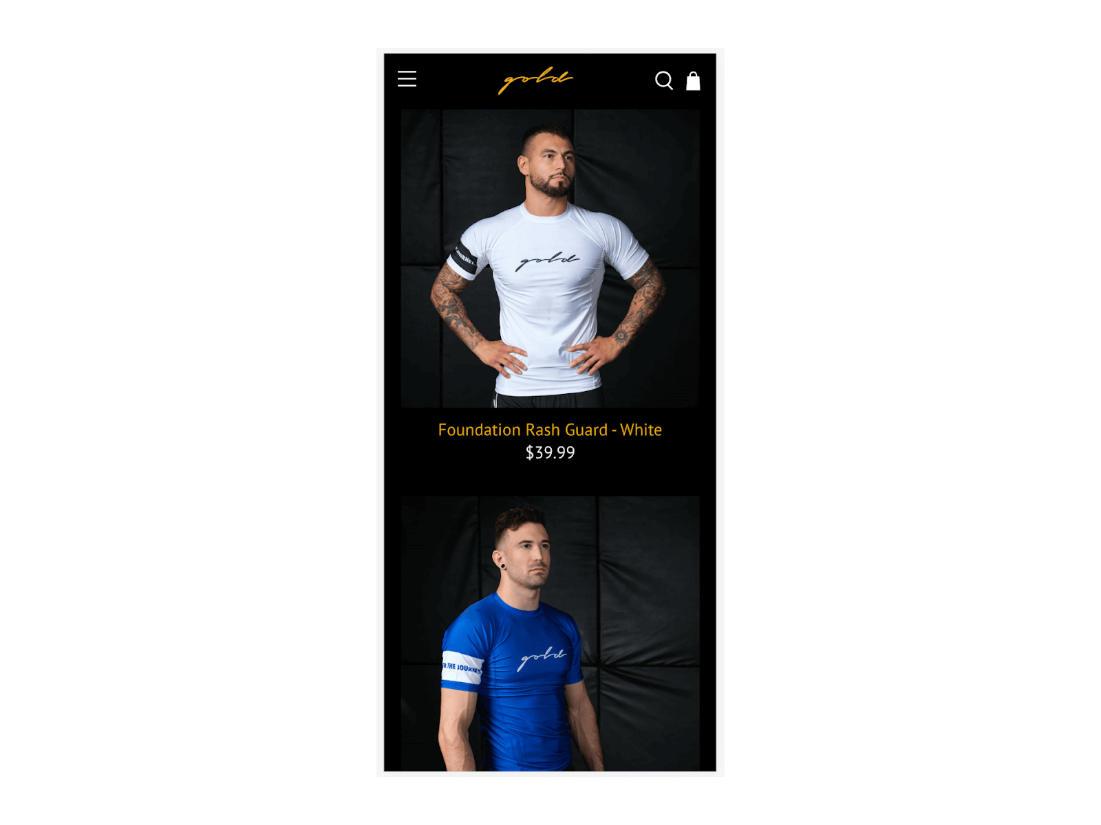
Gold BJJ’s mobile website shows how you can scale down your product listings well for smaller screens, while ensuring that images remain clear and high-quality.
Example: Text Difficult to Read on Mobile

This is an example where spacing and text is poorly translated to mobile. The mobile site looks cluttered and the text at the top of the page comes out too small and hard to read.
Example: Poor Text Spacing on Mobile

Here’s another example of not-so-good mobile optimization. This page feels cluttered - the text in the banner is too small, the black on red coloring (exclusive to the mobile version) is hard to read, and placing long product titles, pricing and promotional details next to the image makes for poor use of space.
Example: Good Use of Space, Easily Clickable Elements, CTAs that Stand Out

If you can learn about how to structure an e-commerce site effectively from anyone, it would be from Amazon. In their mobile product pages, their CTA buttons stand out, it’s easy to see (with icons, design or simply a different color text) what’s clickable and not, and they use space and visual hierarchy well on the smaller screen.
Example: Intuitive Mobile Navigation

Rainbow Shops shows up again as an example of good mobile optimization, this time in regards to their navigation. Instead of the hover-based nav menu on their desktop site, the mobile site utilizes a native navigation menu that’s easy to use on touch screens, and easily shows how to exit/go back to the previous menu.
Example: Altering Hover Animation to Fit Mobile

In one more example, Culture Kings makes a small but very effective change. Where on the desktop site you can hover to reveal size choices and quickly add a product to your cart, the mobile site alters this (as hover animations don’t work on mobile), giving a large and obvious “Add to Cart” button that does the same thing.
How to Ensure Your Site is Optimized for Mobile
So how can you be confident that you’ve done all you can to optimize your website for mobile visitors?
First, follow the best practices for mobile optimization by checking off each of the key elements listed above. Use this as a checklist when doing your first run on mobile optimization.
Second, be sure to test it out on mobile, and test on a variety of devices and screen sizes.
You can do this using Google’s inspect tool, which lets you view your site between different resolutions, and includes numerous presets for popular smartphone models.
Even better, actually test your site on real mobile devices and note down any design or usability issues you notice.
Better yet, when you first design your site, design it for mobile first. The majority of site owners still build desktop-first, even if the data shows that more people access the site on mobile. You can really stand out by building your site specifically for mobile users.
Today, mobile optimization is no longer a “nice to have”. It’s essential for just about any business - but specifically for e-commerce businesses - to have a website that works well and looks great on mobile.
If your site is not yet mobile optimized, do that now before anything else.
FAQs
Convert your website into a mobile app
