8 Best Mobile Website Optimization Tools To Grow Your Website

In this article we're going to share the best mobile website optimization tools, to ensure your website meets the standards expected from modern web users.
Today, your website simply must be mobile-friendly. More than half of all internet traffic around the world comes on mobile. You can't afford to serve a poor experience to such a big segment of your audience.
Thankfully, there are a number of tools you can use (alongside following basic mobile website best practices) to make sure your site is mobile-friendly. Read on to find out.
What Makes a Mobile-Optimized Website?
When we talk about a mobile-friendly website, what does that actually mean?
There are a number of elements that go into a website that's optimized and friendly for mobile users. You can essentially use this list of elements as a checklist when optimizing your site, to ensure you haven't missed anything.
Here's a summary of what you'd expect from a mobile-optimized website:
- Design that looks and works well on vertically-oriented screens, as well as smaller screen sizes.
- A site that is "responsive" - meaning your website scales to look natural on a variety of screen sizes.
- A user interface that works well with touch screens (easy to tap on clickable elements, easy to scroll and navigate).
- Fast, smooth loading on devices with less processing power and slower internet connections.
- Your website also checks all the boxes for mobile SEO optimization.
Hitting some of the finer points of mobile web optimization can be tough, especially if you're not really a web developer. But that's why the following tools exist, to make it easier for you to be confident that you've done all you can to make your website mobile-friendly.
8 Mobile Optimization Tools To Build Responsive, Mobile-Friendly Websites
There are a number of tools out there that help you mobile-optimize your website, in a variety of different ways.
Some test your website and show you whether it has any problems to do with mobile usability. Some help with design, responsiveness, speed or other areas that relate to making your website easier to use on mobile.
Let's dive into the list now and check out what tools are out there to help you ship a 100% mobile-friendly website.
1. Google’s Mobile-Friendly Test
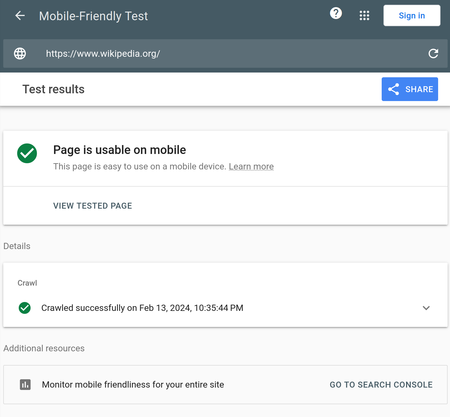
A quick and easy way to check if your website is mobile-friendly is the Google Mobile-Friendly Test page.
It’s simple; you just drop a link to your website (you can also check individual snippets of code) into the box and Google gives you the results.
Right up front, you get a quick result about the mobile optimization status of your site. If you want, you can view the code, a screenshot of the page as it will look on mobile, and more information.
While you don’t get much else, this tool is a quick and easy way to ensure your website will work well on mobile.
2. PageSpeed Insights
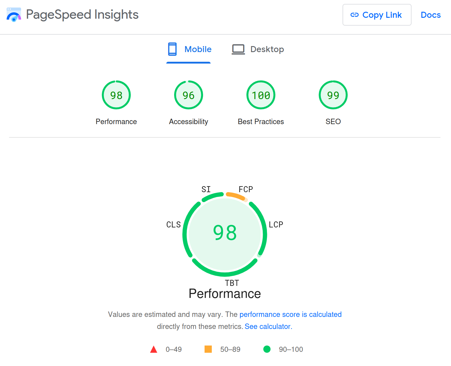
PageSpeed Insights is another tool from Google, and the best way to ensure your website is lightning-fast on mobile.
As the name implies, it tells you how fast your website loads. You get results for both desktop and mobile versions of your site. The score is out of 100, so the closer you are to that, the better, for each category including performance, accessibility, best practices, and SEO.
PageSpeed Insights highlights Google’s Core Web Vitals. These are stats that Google values in its search algorithms and that it considers essential to a good user experience.
The first Core Web Vital is Largest Contentful Paint (LCP), which measures the amount of time it takes for the biggest element on a page to fully load. A low score is good, because it means your website is fast.
The next is First Input Delay (FID), which measures how long it takes before someone can actually do anything on your website. Again, a lower score is better.
The final Core Web Vital is Cumulative Layout Shift (CLS), which measures how much the layout of your website moves around, or “shifts,” as everything loads. You want this to be as close to zero as possible, which means nothing moved around before everything loaded.
There are even more in-depth results for other aspects of your website, plus additional stats for each category. Much like Google’s mobile-friendly test, these results give you an idea of what to do, but they don’t directly let you optimize your site on the spot.
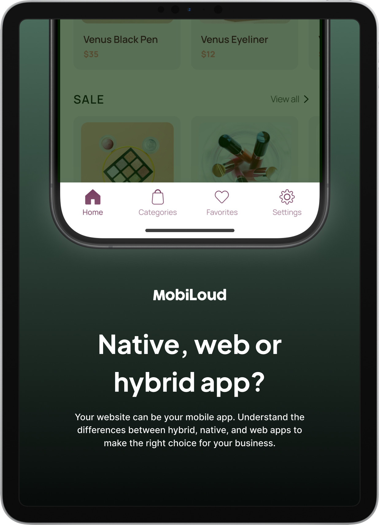
3. MobiLoud
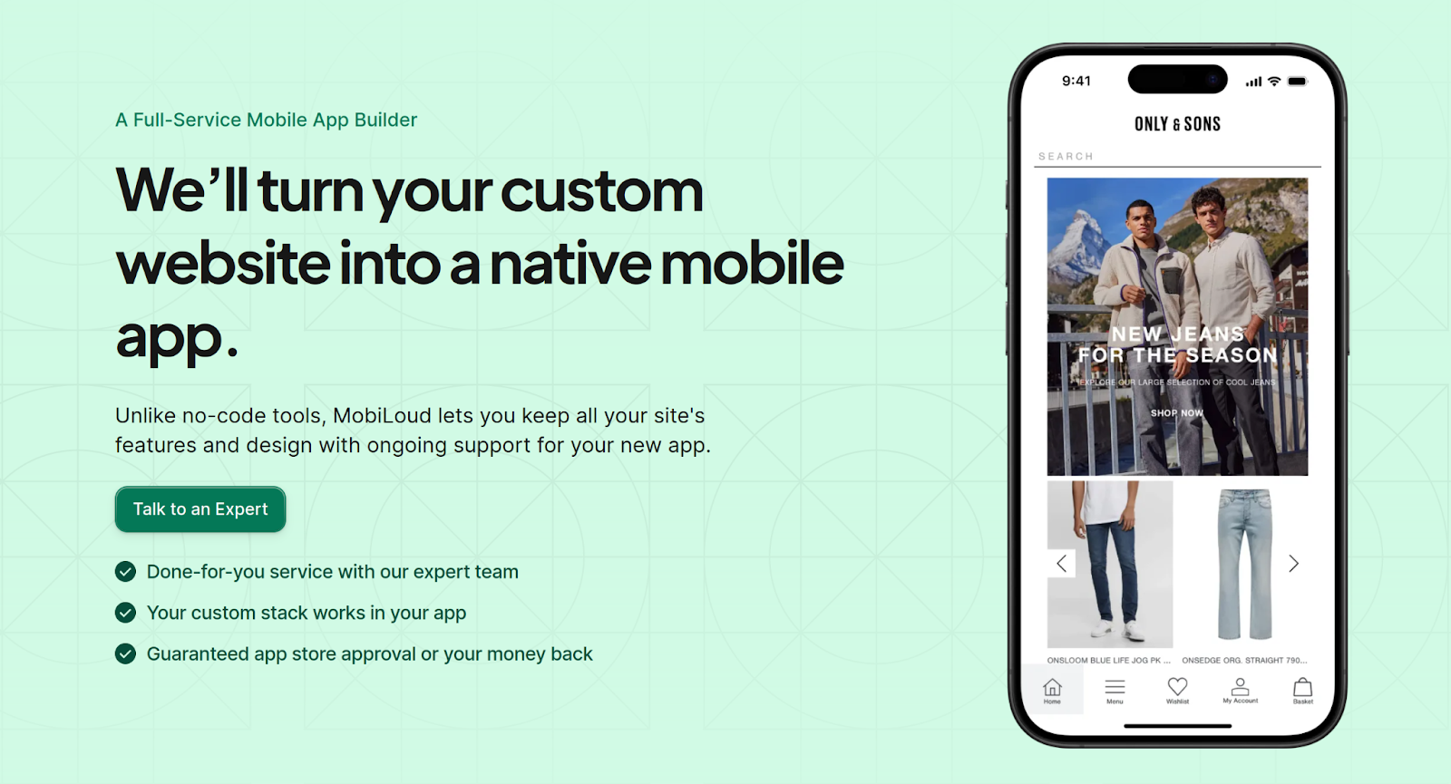
If you really want to offer a fully optimized mobile experience to your users, you'll want to offer a mobile app.
There's only so far you can go in terms of making your website mobile-friendly. An app lets you escape the browser and offer a truly mobile-first user experience.
Our platform, MobiLoud lets you convert your website into mobile apps, with zero coding or knowledge of mobile app development required.
It converts your whole website into apps, fully synchronized to ensure no duplication of effort between the two platforms.
Your app will be like your mobile website, only better, with the addition of mobile-specific navigation UI and no browser tabs taking up a portion of the limited screen size.
Our team does everything for you, from building your apps to publishing them in the app stores and handling technical maintenance after launch.
We'll even provide custom design and development for your mobile website to ensure your web experience is fully mobile-optimized before converting it to an app.
That really makes MobiLoud the ultimate service when it comes to making your business fully mobile friendly.
If you want to experience the benefits of mobile apps, get in touch with us now and book a free consultation.
4. Responsive Design Checker
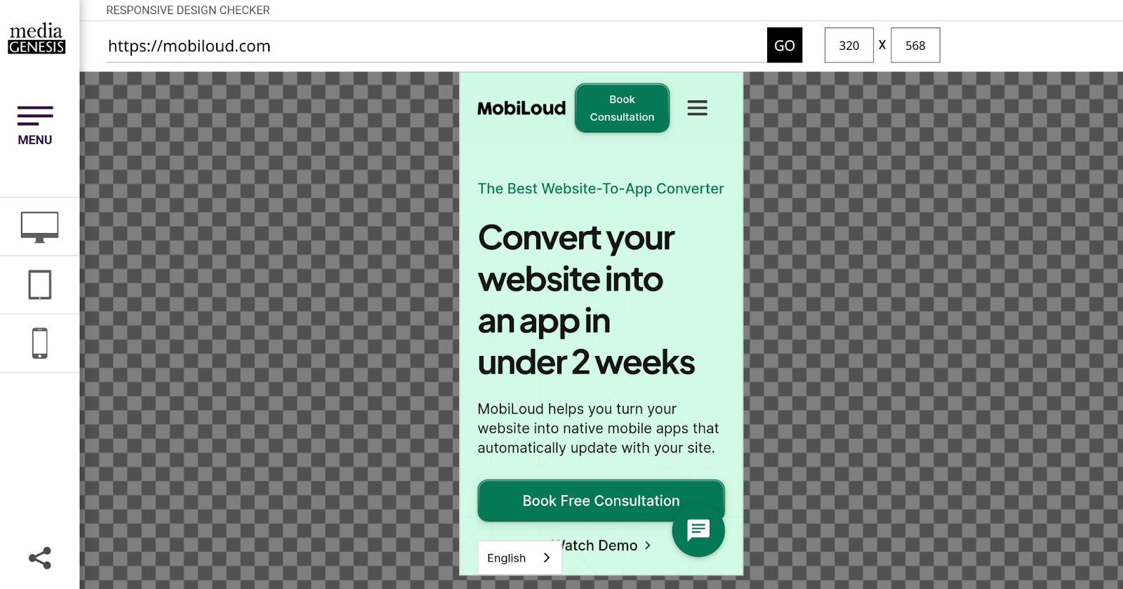
As we discussed earlier, optimizing for mobile means your website design should be responsive. Responsive Design Checker lets you check if that is the case. You get a live simulation of your website on a mobile device right in your browser.
You can choose from different phone models, scroll your site, and see what it will look like at different sizes. Some of the models and sizes are quite old and small, so if you want to ensure your website will work for all your customers, this is a great tool to use.
Furthermore, you can specify a custom resolution to see how your website behaves on oddly-shaped or sized screens.
5. Screaming Frog
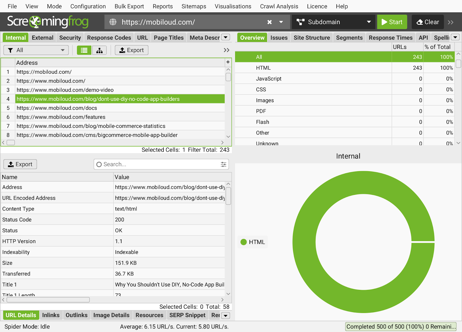
Optimizing for mobile SEO is one area that a lot of people miss in the mobile optimization process.
Screaming Frog is one of the top tools in the SEO industry for technical optimization, and is particularly useful for ensuring your website is optimized to show up in mobile search results.
You have to download and install the Screaming Frog program on your computer. It is compatible with Windows, Mac, and Linux. After you install it, you can point it to your website to find broken links, analyze pages, titles, and metadata, and check your redirects. Furthermore, you can use the tool to detect duplicate or redundant content, and much more.
There is a free version and a paid version of the Screaming Frog mobile optimization tool. The free version is feature-limited and only crawls up to 500 URLs. The paid version lets you do more, but it costs $259 per year.
6. Google Analytics
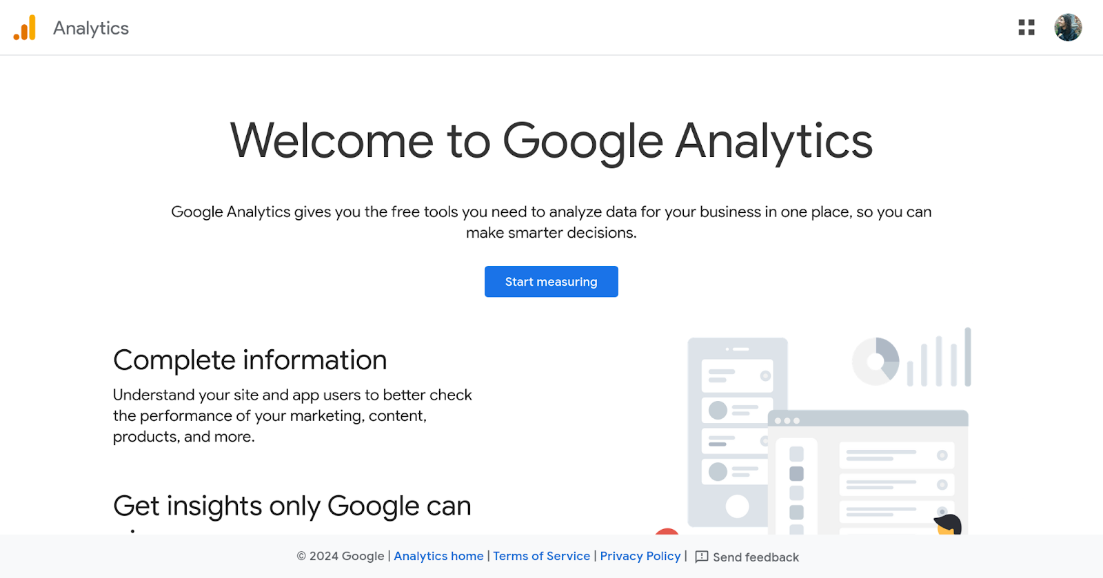
Do you want the ultimate in detailed information about your website and how to optimize it for mobile? Google Analytics lets you dive deep into the data to see what’s going on.
You can use Google Analytics to see how people behave across devices, pages, and more. You get a breakdown of how different channels funnel into your website and how each is performing. You even get predictions to see what to focus on.
Google Analytics gives you data on how your mobile visitors behave, where they came from, how long they spend on your site, and much more.
Some example types of data include traffic source data, which tells you where someone came from, how they got to your site, and if they arrived after an organic or paid search. Content data tells you the URLs of the pages they visit on your site and how they interact with that content. Transaction data includes anything they purchase.
After Google Analytics gathers data, it can create reports. These are handy for sharing with your site building team to get everyone on the same page and address issues. Plus, after generating a few reports, you can track how your mobile optimization efforts are working over time and use this data for A/B testing.
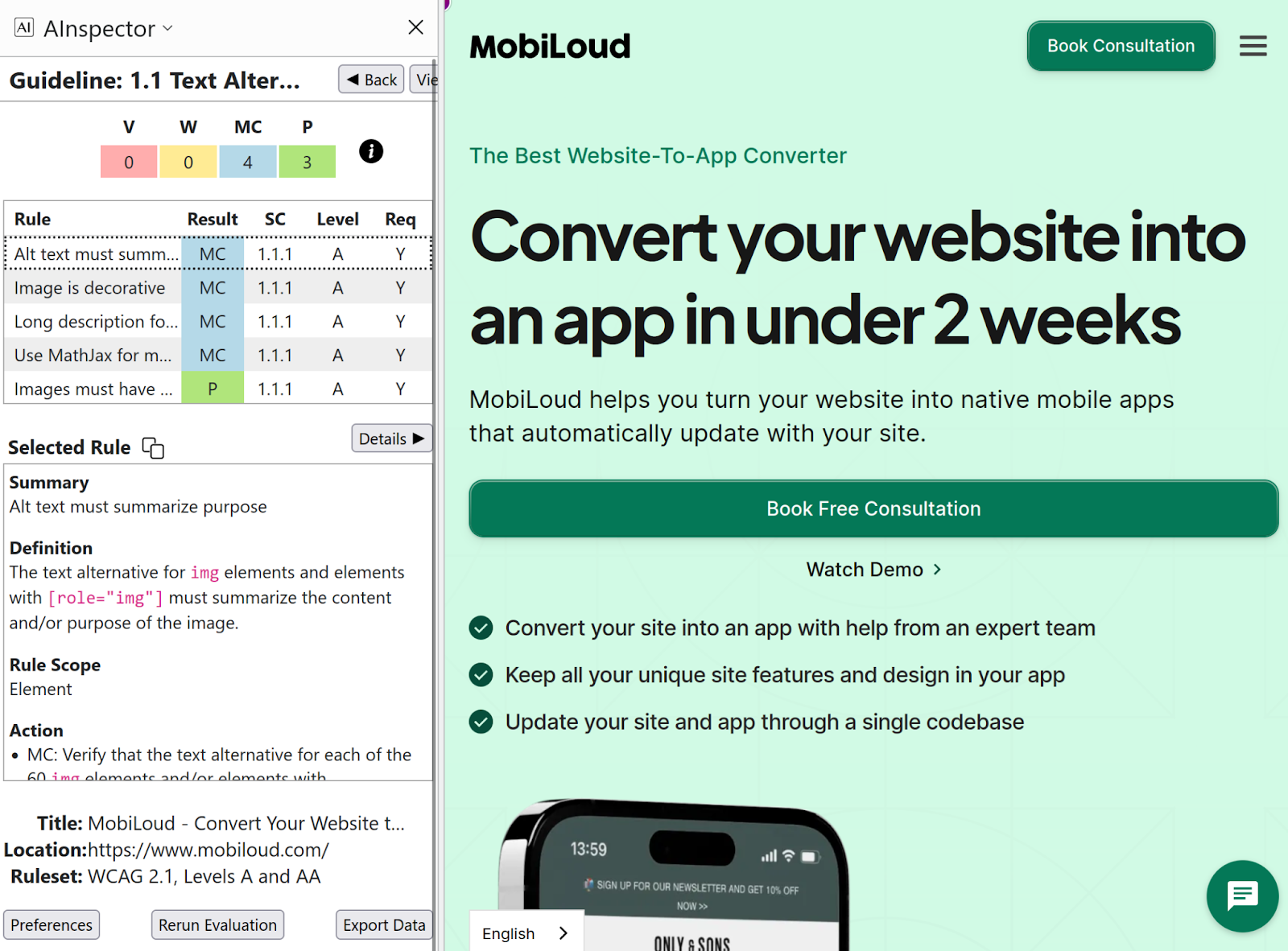
7. AInspector
Accessibility is an important part of both mobile and desktop optimization. Ensuring that your site is accessible for people with disabilities is essential, and the AInspector extension for Firefox lets you do that.
It will inspect your website and give you a report on how well it adheres to the Web Content Accessibility Guidelines (WCAG) 2.2. These include such aspects as making sure all images have alt text, that content is broken down under headers and footers, that colors are beng used properly, and much more.
You get results on how many rules you have violated, how many warnings you’ve stacked up, and what’s passed the checks. If you want, you can also export this data so that other people can use it.
8. WAVE
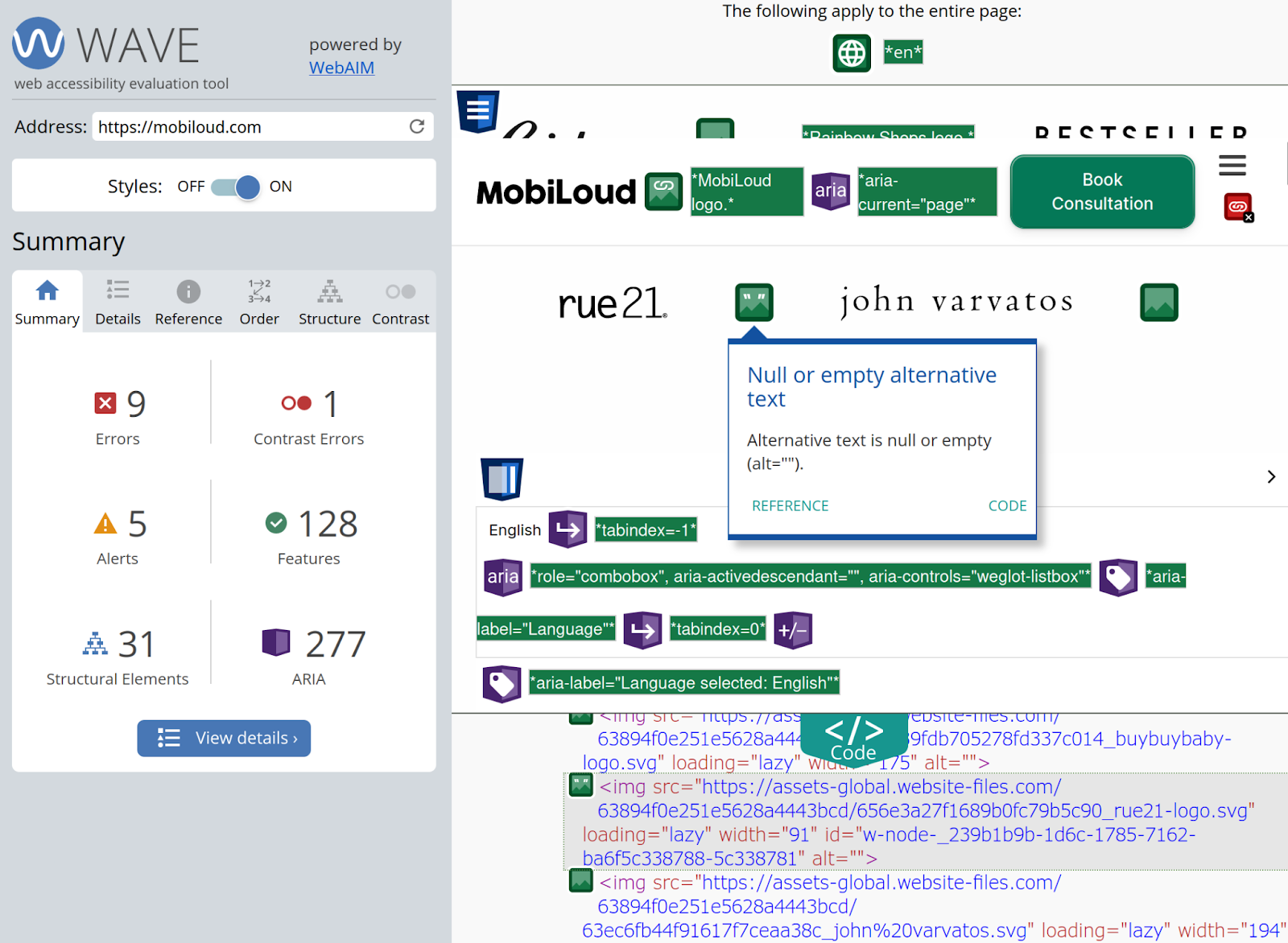
WAVE (Web Accessibility Evaluation Tool) is another accessibility checker. It’s a website and browser extension, unlike AInspector, so it works with many more browsers. Plus, its user interface is a bit more friendly. If you find AInspector intimidating, try WAVE.
You can click on specific errors and alerts on your website to see what an issue is, which is handy for pinpointing issues. Plus, you can view a detailed list of everything.
You get at-a-glance notifications with WAVE, too. Anything in red means that issues should be fixed, while green means that aspect improves accessibility and ideally you should include it. Yellow indicates something that deserves a closer look.
You don’t necessarily want to eliminate every icon. Some of the icons are there to help you out. Instead, focus on solving red icons first, and then address other issues.
Optimizing Your Website For Mobile: The Bottom Line
Perhaps the biggest thing you can do to optimize your website for mobile devices is to turn it into an app.
Mobile apps offer the peak in mobile friendliness - they're made specifically for mobile users, after all.
MobiLoud makes it easy and affordable to launch your own app. We do all the work for you, and we'll even help your mobile website look and work better for mobile users.
Before anything, check your website with tools like Google's Mobile-Friendly Test and Page Speed Insights, and fix any critical errors in mobile optimization.
But once you've done all the low-hanging fruit, get in touch with us and book a free consultation to see how MobiLoud can make your business truly mobile-first.
Since you're already here, did you know that you can get a free preview of your app in 30s? All you need is your website's URL.
Get started with a free account. No credit card required.


