Checkout Optimization 101: Designing The Ideal Checkout Flow


Your checkout flow is a critical part of your overall customer experience.
The global cart abandonment rate stands at a staggering 69% - and the majority of abandoned carts happen during checkout.
The checkout is the money page. The key, make or break moment where you either get paid or the customer abandons their cart.
Reducing the bounce rate here by just a few % can mean hundreds of thousands or even millions on the bottom line.

Luckily, it isn't rocket science.
There are a few logical factors that are proven to improve the checkout experience due to the basic facts of human psychology.
By following best practices, measuring the results, and continuously tweaking things over time - you'll have a perfectly optimised checkout and make more money.
So, if you're ready to take your checkout process from good to great, you're in the right place.
Read on and let's cover the strategies that will help you keep your customers happy and your sales soaring.
Understanding Checkout Optimization
On a high level: our goal is to streamline the process as much as possible, removing friction where we can, while making the customer's experience as smooth and efficient as possible.
Fundamentally, most checkout problems are caused by unnecessary friction, over-complication, and a lack of upfront transparency.
Common Checkout Challenges
More specifically, these common culprits can ruin checkout UX, leading to customers getting frustrated and putting their credit cards back in their wallets:
- Confusing navigation or complex processes that frustrate shoppers
- Lack of transparent pricing or unexpected costs added during checkout
- Insufficient payment options that don't meet customer needs
- Security concerns and lack of trust
These tend to be the core problems. In a later section, we'll cover all the ways these crop up in much more detail.
Fogg's Behavior Model
B.J. Fogg, psychologist and behavior scientist at Stanford, is famous for creating the Fogg Behavior Model.
The model is useful as an overall north star for our checkout flow optimization.
Fogg's model essentially states that the likelihood of a specific behavior is determined by three elements converging at the same moment:
- Motivation
- Ability
- A prompt
Put another way, you need to make it easy for someone to do something, make them want to do it, and then trigger them to take the action.
The prompt must come when motivation and ability is high. Otherwise it will be perceived as irritating and will be less effective.
As you read through the advice in this article, think about how it ties into Fogg's model - everything we do will be somehow increasing motivation and ability.
What Makes a good Checkout Flow
So, given what we've learned, what makes a checkout experience good?
On a high level: simplicity, clarity, and speed.
Well optimised checkouts tend to have:
- Clear Navigation: guiding customers through the process with intuitive design and clear instructions
- Transparency: disclosure of all costs upfront, including shipping and taxes, to avoid unwelcome surprises for customers
- Multiple Payment Options: a variety of payment methods for different preferences
- Mobile Optimization: a smooth UX process on mobile devices, where a significant % of transactions occur
- Security & trust Features: display security badges and trust signals to reassure customers that their information is safe
We want to inspire confidence in the customer, and trust in our brand, while respecting their limited time, privacy and attention span.
In Fogg's terms, we want to maximise their motivation and ability to complete the checkout while prompting them to do so optimally.
8 Checkout Optimization Best Practices
Let's get more granular with 14 specific, actionable tips.
In CRO, best practices are not to be blindly followed, but they are to be used as a starting point if you're getting subpar results.
Once we have all the best practices covered, then we can establish a useful baseline from which to test, measure and tweak in a continuous process of optimisation.
1. Allow Guest Checkout
If there's one thing you take from this article: allow guest checkout.
This is an absolute must for reducing bounce rates and abandoned carts. One ecommerce brand made an additional 300 million dollars simply by ditching forced registration and allowing guest checkout.
If you don't need them to create an account or even log in to order, why would you make them?
You're adding friction and decreasing the customer's ability to make complete the checkout, therefore making it less likely.
Don't be needy, don't be greedy for information for your CRM. Respect their time and privacy, and give the option to check out as a guest if you can.
It's also important that the Guest Checkout option is the most visually prominent.
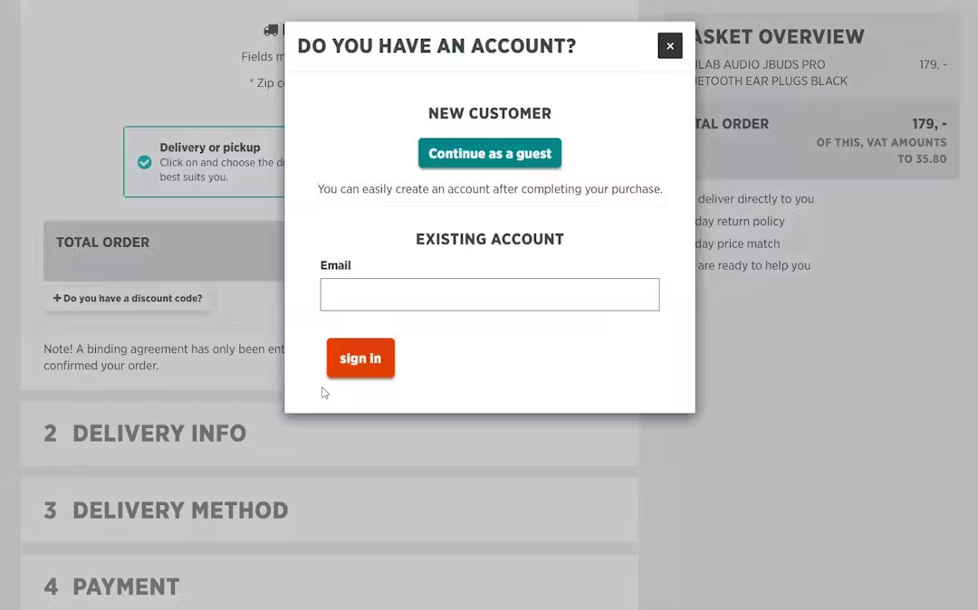
Of course, you can and should incentivise account creation too. You can do this with a simple message like this, lifted from the $300m example above:
“You do not need to create an account to make purchases on our site. Simply click Continue to proceed to checkout. To make your future purchases even faster, you can create an account during checkout.”
2. Simplify & Optimize Forms
According to research by the Baymard Institute:
The average checkout flow today is 5.2 steps long and has 11.8 form fields..... This unnecessarily increases the perceived and actual complexity of a checkout for the end user
They also found that 26% of users have abandoned purchases during the checkout solely because it was too long or complex.
For most sites, the form fields can be reduced to 8, so this is a good target to aim for.
Baymard have a few suggestions for reducing form fields and simplifying the process for customers:
- Opt for a single "Name" field rather than separate first and last name fields
- Consider hiding unnecessary fields like "Address Line 2", "Company", and "Coupon Code" to simplify the form
- Implement zip/postal code autodetection to streamline the address input process
- Hide "Billing Address" fields when possible, assuming it's the same as the shipping address
- Allow users to delay account creation until after the checkout process is completed
Reducing the overall number of form fields only to the essentials reduces the cognitive load on shoppers, making it much easier to complete purchases.
You should also try to pre-fill forms wherever possible to reduce friction further.
For a deeper dive, check out:
3. Use Progress Indicators
Progress indicators guide users through the checkout, offering a visual cue of their completion status.
It helps customers to understand:
- How many steps they’ve covered
- Which checkout steps lie ahead
It's a way to reassure customers that they're making progress, and that the end is in sight. This can reduce the chances of them becoming frustrated and quitting.
Make the progress indicators:
- Visually prominent
- Simple and understandable
- In keeping with your brand
This can significantly enhance user experience by setting clear expectations.
4. Add Trust Signals
Remember that you're asking people to hand over important personal information and money. You really need to make sure that a lack of trust doesn't put them off at the last moment.
This is absolutely crucial, with some estimating that up to 50% of cart abandonments are due to security concerns.
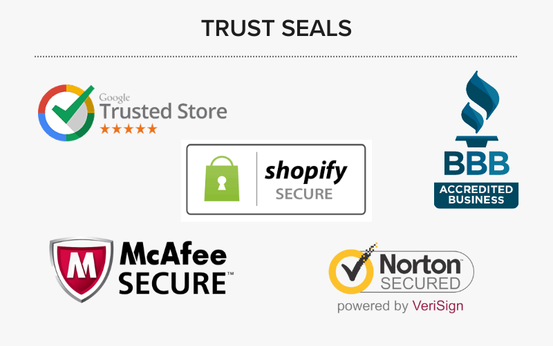
Research also suggests that a customer's perception of the security of the checkout is driven by "gut feeling" and that they make an evaluation very quickly. Some ways you can nail this:
- Use well-known trust signals like SSL certificates and trust badges
- Confirm that you offer secure payment options
- Explicitly explain what "SSL" means if you have non technical customers
- Visually highlight the credit card field (more later on)
According to more research by Baymard Institute, the actual specific certificate you use doesn't seem to matter much, with completely "made up" certificates with padlock logos performing better than the majority of official badges.
The important thing is that it "looks" like a secure checkout should look in the customer's mind.
5. Offer Free Shipping & Remove Additional Costs
Unexpected costs are the number one reason for cart abandonment.
The customer getting to the checkout and seeing that the real price is 20% higher than they were expecting is a sure way to have them close the tab. Nobody likes "surprises" of this nature.
That's why free shipping is offered by a ton of the top brands today. According to Invesp:
"9 out of 10 consumers say free shipping is the top most incentive to shop online more and orders with free shipping average around 30% higher in value. 93% of online buyers are encouraged to buy more products if free shipping options are available whereas 58% of consumers add more items to cart to qualify for free shipping"

There are many ways you can go about this.
For a start, be upfront on the product pages about any shipping costs you have and make customers aware of the price inclusive of taxes.
When it comes to offering free shipping, its something you need to think about how it makes sense for your business.
For example you could offer it for all items, over a certain order threshold, or to members or repeat customers.
A popular one is to offer it over a certain threshold, for example 10% higher than your average order value. This could actually increase AOV itself, interesting research by UPS found that ~40% of customers will often increase their order to get free shipping when available.
6. Offer Multiple Payment Options
According to the Baymard Institute, 21% of all online stores fail to offer more than one payment option.
These days, that isn’t enough.
According to Statista, the traditional credit and debit card payments are still popular, making up ~30% of ecommerce transaction volume in recent years.
Digital wallets though have emerged as the #1 option though in recent years, driving more than half of all transactions and predicted to rise to 56% by 2026.
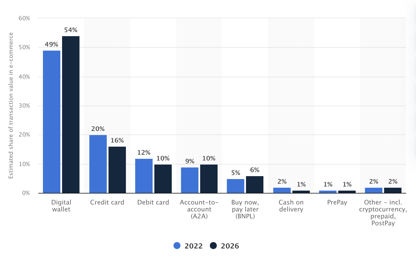
Other payment methods are also growing in popularity, albeit more slowly.
A growing segment of customers appreciate buy now, pay later (BNPL) services. According again to Statista:
BNPL accounted for 5 percent of global e-commerce transaction volume last year and is expected to grow at a CAGR of 16 percent between 2022 and 2026.
BNPL platforms are lead by PayPal currently, with dedicated services like Klarna, Affirm and Afterpay capturing decent slice of the market.
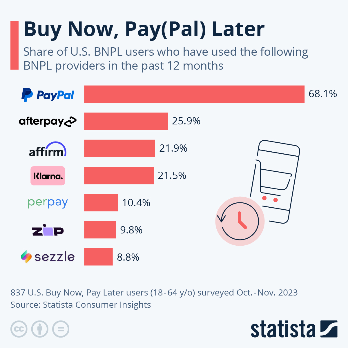
Depending on your niche - you may also want to consider other options like cash on delivery or crypto payments.
So the bottom line: make sure you offer the option to pay by digital wallet, credit and debit card, and BNPL if appropriate. You’ll make more sales and your customers will be happy to have their preferred option available.
This Baymard Institute article has some other good payment UX tips for a deeper dive.
7. Make it Fast and Mobile Friendly
According to Statista - in 2023 $2.2 trillion of ecommerce sales occurred on mobile. That’s 60% of total sales worldwide.
So having a great mobile checkout UX is crucial.
The first thing is to make sure everything loads fast.
Google research way back in 2015 found that consumers are more impatient on mobile, and since then they’ve come to expect an even better and faster experience as web and mobile technology have both improved dramatically.
This is something to task your web developers with. If you think your checkout might be too slow on mobile - optimizing images, using browser caching, and cutting out any heavy scripts are all potential improvements.
When it comes to the general UX, less is more. Make sure you minimize the number of steps and form fields required to complete the purchase, leveraging autofill and stored payment information whenever possible.
8. Make your Cart Persistent
This isn’t exactly a checkout optimization tip, but it’s closely related.
A persistent cart saves the items a customer has added. Even when they abandon their cart and “bounce” from the site, when they return later, the cart will still have the same items in it so you have a second chance at getting them to complete the checkout.
Persistent carts generally rely on cookies for guest users, and user data for customers who are signed in to your store.
Persistent carts should be used alongside abandoned cart notifications - email, SMS and mobile push notifications that remind customers of the items in their cart and nudge them to return and complete the purchase.

This is very effective.
You can use a service like Mailchimp, Klaviyo, or OnmiSend for email and SMS notifications.
For abandoned cart push notifications - more effective than both email and SMS - building apps with MobiLoud is the best option. We built a custom feature that sends abandoned cart notifications on autopilot (more on that later).
Testing and Analyzing Checkout Performance
Once you've implemented the above you'll have a good starting point for the optimal checkout experience.
As we said though, best practices aren't to be blindly followed in all cases. They're best seen as a starting point for further testing and optimization.
Let's look at how to use A/B testing to analyze your checkout data so we can continuously refine and improve.
A/B Testing Checkout Elements
A/B testing, also known as split testing, involves comparing two versions of your checkout page to determine which one performs better.
This allows you to make data-driven decisions and improve your checkout.
To get started:
- Identify important variables: pinpoint elements on your checkout page that might affect the buyer's decision. These could range from the layout, call-to-action (CTA) buttons, form fields, different trust badges, and copy
- Create variants: Develop alternate versions of your checkout page. Change one element at a time to isolate its effect on the conversion rate.
- Test Simultaneously: Launch both versions of your checkout page at the same time to a similar audience, so that external factors don't skew your results.
- Analyze Results: Use analytics tools to measure which version leads to higher conversion rates. The key is to focus on statistically significant data to guide your decisions.
Remember, A/B testing is an ongoing process. Continuously test and update your checkout page to adapt to what your customers are telling you.
You can get a thorough guide to A/B testing here.
Analyzing Checkout Conversion Rates
Whatever tool you use to test and gather data on your checkout, there are a few common pointers to keep in mind.
- Track the Right Metrics: Focus on metrics that directly impact conversions such as cart abandonment rate, average order value, drop off points, and dwell time.
- Customer Journeys: map out the customer's path to purchase to pinpoint where you're losing potential sales. Tools like heatmaps, session recordings, and form analytics can give insights.
- Segmentation: Break down your data by customer segment (e.g., new vs. returning customers, mobile vs. desktop users) to uncover specific patterns.
- Performance Benchmarks: Compare your metrics against industry benchmarks to set realistic targets for improvement. Also establish your own benchmarks to track future improvements and optimization.
By implementing the 8 best practices we outlined above - and by continuously testing and tweaking - you’ll be well on your way to an optimized checkout.
How to Deal with Abandoned Carts
One key point we made was the importance of a persistent cart.
Unfortunately, even with a perfectly optimized checkout you’ll still get abandoned carts. Life happens, people get distracted suddenly, anything can happen.
What you do after they abandon their cart is just as crucial. Effective cart abandonment strategies can transform lost opportunities into conversions.
Here are a few important tactics:
- Act Quickly with Email Reminders: send abandoned cart reminders by email, SMS and push within 24-48 hours. Highlight key incentives like free shipping and returns, and ensure the call-to-action (CTA) navigates directly back to the checkout (with their items saved)
- Personalize the Recovery Experience: Tailor your messages to display the specific products left behind. Personalization increases the relevance and urgency of the message, making it more effective
- Offer Incentives: Sometimes a small nudge is all that’s needed to convert an abandoned cart into a sale. Consider offering a limited-time discount or free shipping to entice customers back to their carts.
A particularly powerful tool is abandoned cart push notifications.
Build the Ultimate Mobile Checkout with MobiLoud
There are plenty of platforms for sending email and SMS notifications to customers.
Push notifications are in a league of their own though, but you can only send them through native ecommerce apps for iOS and Android.
Native ecommerce apps usually take months to build though, and cost hundreds of thousands of dollars.
This is where MobiLoud comes in. We build apps for you, in just weeks for a fraction of the usual price. We do this by converting your existing web store into iOS and Android apps. These apps are high-end, feature rich, and worthy of a multibillion dollar brand.

The great thing about this is that you can reuse everything from your existing web store. That includes your now well-optimized checkout experience.
Everything we’ve previously recommended - from multiple payment options and trust signals to progress indicators and guest checkout - will work in your apps just like it does on the web.
That means you can just focus on creating a great mobile UX for your web store, and the apps will take care of themselves because they update automatically and sync directly with your site.
We give you unlimited push notifications - you can send out targeted, customized push messages how you want, when you want.
And we built a special feature for abandoned cart notifications too. It uses local notifications, and detects when a user has closed your app with items still in their cart. This triggers a notification sequence designed by our team to entice users back into the app and close the sale.
It’s everything you need to give users the best possible experience on mobile, boost sales and conversions, and maximize cart recovery.
Check out some of our example apps, and get in touch with one of our team to learn more.
Since you're already here, did you know that you can get a free preview of your app in 30s? All you need is your website's URL.
Get started with a free account. No credit card required.